Balatro's 'Cursed' Design Problem
Mini: How design choices clash when put in front of players
Balatro! It’s the hot new indie darling. It shifted a million copies in a month, it’s been streamed by pretty much everyone on Twitch, and it’s one of the top rated games of 2024 so far. I’ve also played it… quite a bit.
But, this game has - and this is according to its own designer - a “fundamental design flaw”. A “cursed problem” that the designer has been unable to solve. Let me explain.
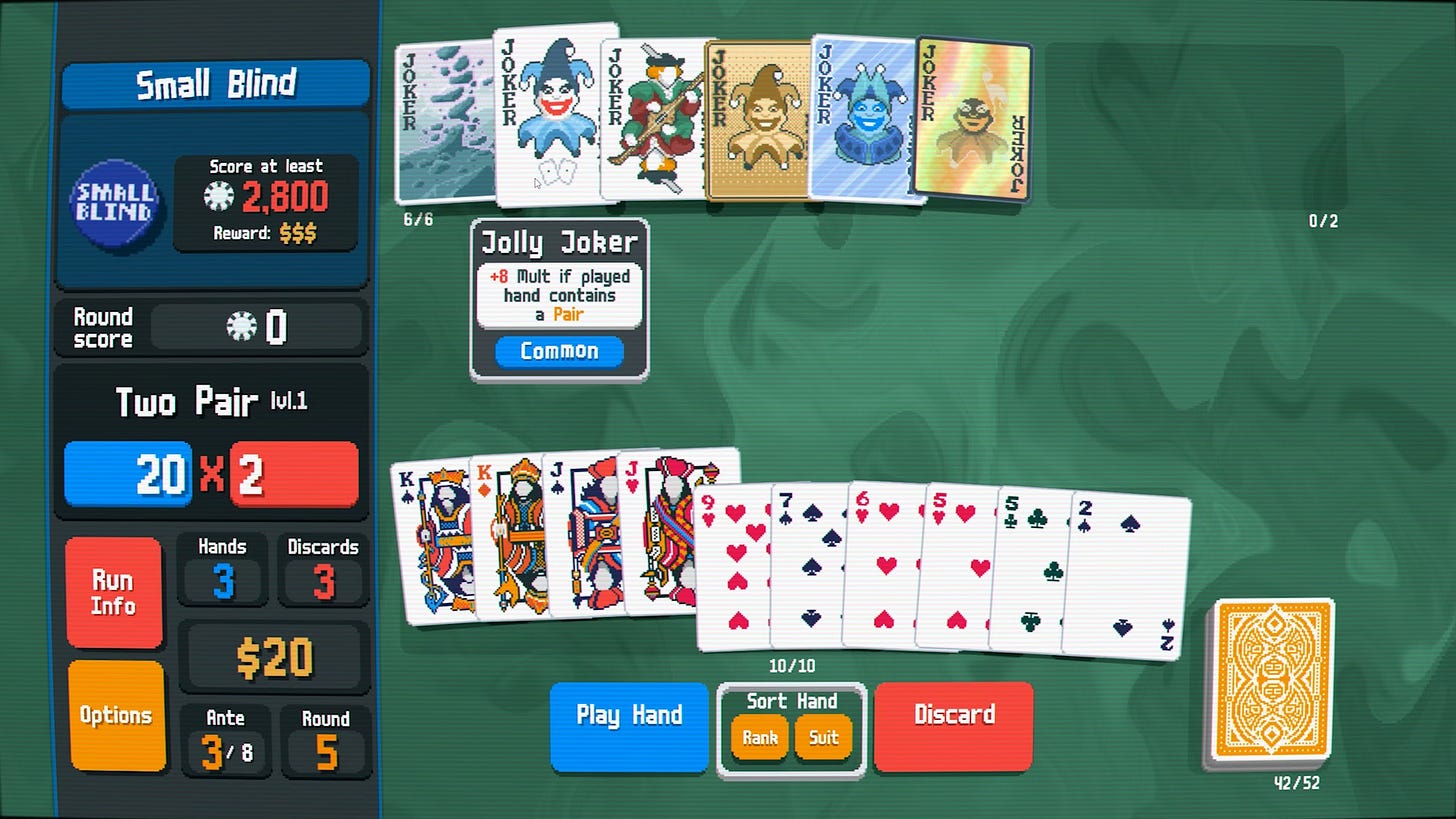
First - if you somehow haven’t played Balatro, it’s a card game about trying to find poker hands in order to score points. Better hands score bigger points. But on top of that, you can do all sorts of wily tricks to boost your score. Special cards rack up more points. Crazy joker cards change the rules of the game. And you can stack your deck - or toss away cards - to make certain hands more happenable.
It’s a really fun game - a sublime, synergistic slot-machine that feels fun to play, and is even more fun to break. It’s also really elegantly designed - with its clean UI, straightforward concept, and, well, just how much depth has been squeezed out of a few key systems.
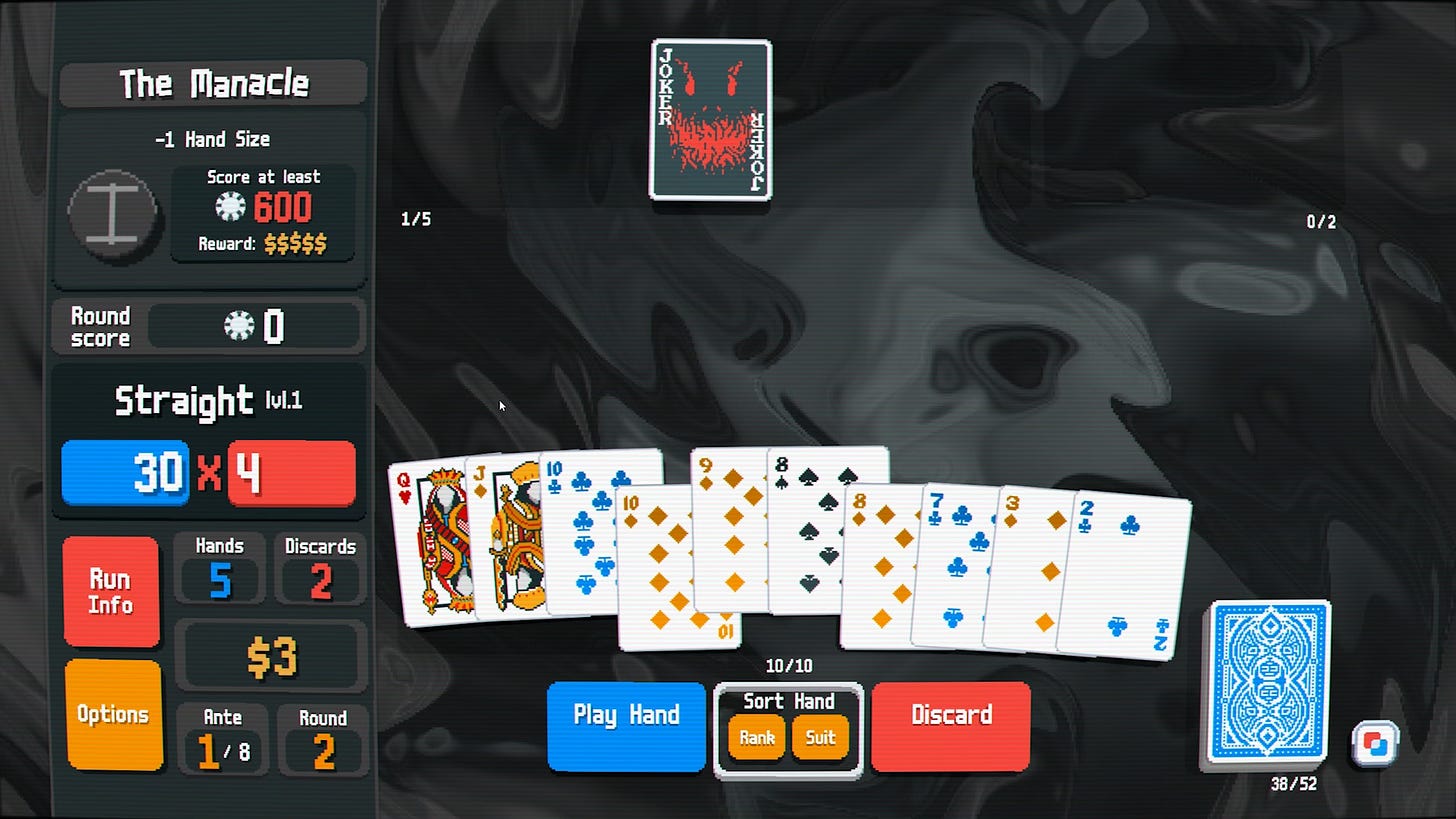
But there’s one… interesting design choice in there. And it’s this: the game doesn’t tell you how many points you’re going to score, before you play your hand. You simply pick your cards, cross your fingers, and hit go.
Now this would be really quite helpful information. It could tell you to play one hand over another. It could tell you if you’re about to scrape past the ante, or miss it by a few points. It could tell you if you’re about to win the entire game - or lose the whole thing and have to start from scratch.
And yet… Balatro doesn’t give you a, let’s call it - a score preview.
Of course, this was an entirely intentional design choice. LocalThunk - the game’s anonymous Canadian designer - has explained that, for him, the joy of Balatro lives in that precise moment I just described. When you cross your fingers and hit play. When you’ve set up your point-scoring engine and hope that it will bring home the bacon.
LocalThunk says…
“My personal belief is that the game is more fun when you set up your Rube Goldberg machine and watch it go before knowing whether or not the hand will win the round.”
And Balatro totally plays into this! There’s so much hype and pageantry after playing your hand. The numbers tick up, with escalating sound effects. Each card and joker steps forward in turn to add their points to the total. If you’re lucky, the score multiplier will set on fire and start to burn hotter and hotter with each multiplication.
And so if you already knew how many points you were going to get. If a bit of UI had pre-calculated the score and told you that you were going to win the ante with this hand… well none of that would matter. In fact, it would just get in the way.
This is not the only reason to forgo a score preview, mind. It would also add cruft to the UI - especially when you need to account for cards that have random properties. How do you elegantly show a range of possible scores? It would slow the game down, incentivising players to check every possible hand to find the highest-scoring combination. And it would change the entire feel - from a chill game about vibing with cards, to a stern spreadsheet-style strategy game.
And so this is a totally legit game design decision, right?
Every game designer has to choose how much information to give to the player. Like, should you show a boss’s health bar, or keep it hidden? Should enemies come up with their strategies in secret, or should their intent be explained to the player?
As I’ve explored in various other videos, how much information a player has will change their behaviour, and change the way the game feels.
And so Balatro hides its score preview to make players act more quickly - and to create a feeling of suspense and drama whenever you play a hand. LocalThunk had an experience in mind - and picked mechanics that would nudge players towards that feeling. A smart design choice.
However! Balatro is not like those other games I just showed. Because while the score preview is hidden from the player… the information is still technically available! Because you can… just calculate it yourself.
So, like…. a straight is worth 30 chips and 4 mult. The cards are going to add an extra 47 chips, and then the two face cards will add another 30 each thanks to the joker. So that’s 137 chips times 4… 548. Not quite enough to beat the ante. But close.
And so if information in a game can be hidden, or visible… Balatro’s score preview falls into a weird half category - hidden, but attainable if you really want it. And that’s the fundamental design flaw at the heart of Balatro. The designer wants the excitement of a slot machine - but also the numerical predicability of an Excel spreadsheet. And so the only way to square that circle is to hope that players won’t bother to calculate the final score.
But if we go back to that timeless Soren Johnson quote - “given the opportunity, players will optimize the fun out of a game” - it shouldn’t be surprising that a number of Balatro players are playing the game with the calculator app open on their phone, or with a spreadsheet set up on a second monitor, or with Steam’s in-game overlay showing a bespoke website that calculates Balatro hands.
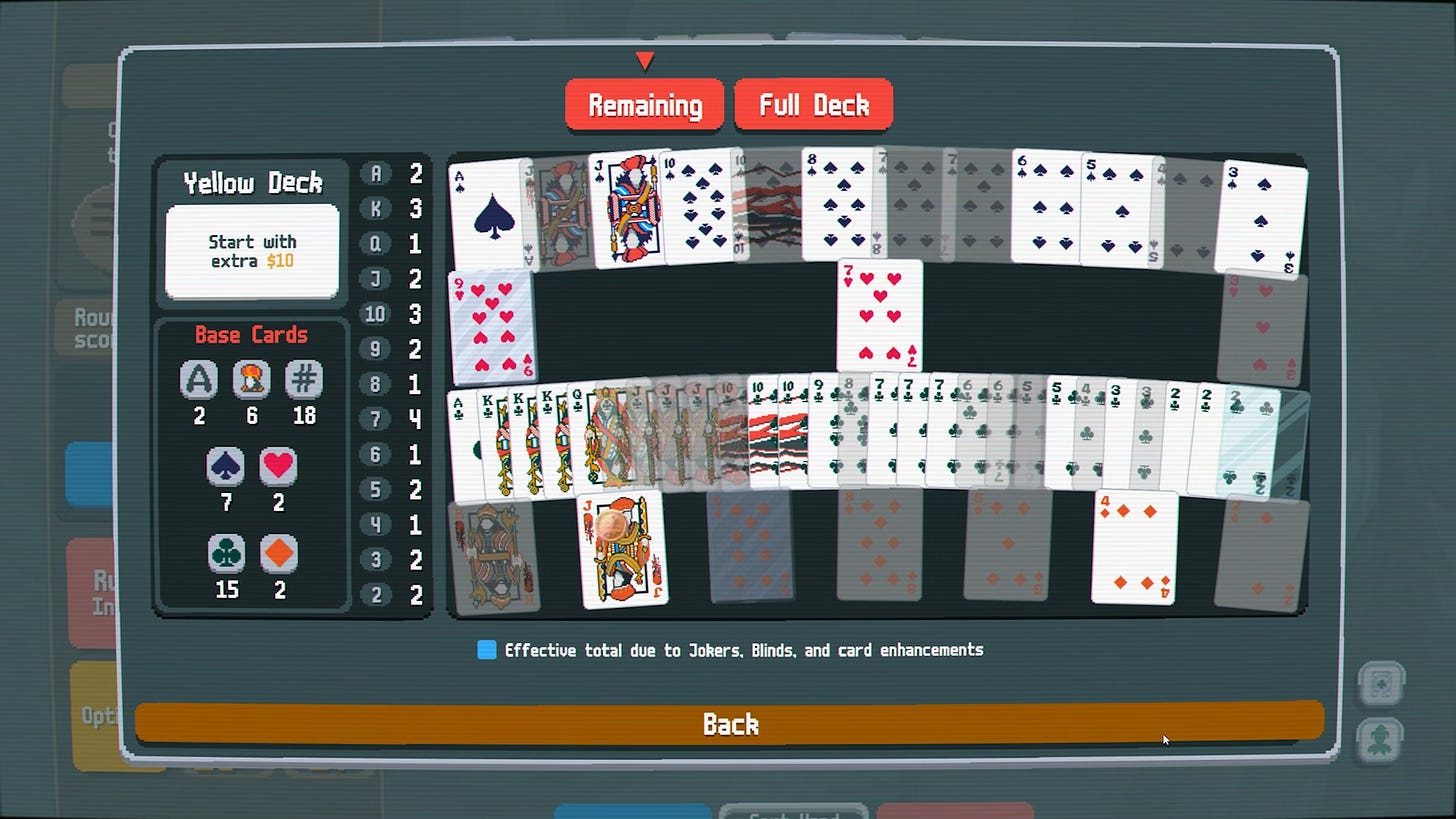
And - actually - this is exactly why Balatro has a deck view. During playtesting, the game did not show you which cards were left in your deck. But - again - playtesters could technically get that information by tracking which cards had already been played. And after polling users, LocalThunk found that many were doing just that - even though it really wasn’t much fun. So he added a powerful deck peek feature.
But a score preview felt different. It felt like it encroached upon the DNA of the game. It stepped on the stuff that made Balatro… Balatro. And so while the designer is empathetic to people who wish to play more strategically. And is bummed out that the optimum way to play involves busywork, and doing calculations outside of the game, he worries that adding a score preview would spoil the fun for those who wish to play more casually.
And that’s totally true! Making a game better for one group can make it worse for another. As a designer you need to be certain who the game is for - and then protect that player base from certain design choices.
Even if that design choice is provided merely as an option. Speaking to the Eggplant podcast, LocalThunk says “if I add an option to have this score preview, people are just going to click on it, and they're not going to experience the game that I wanted to create.”
And besides - should a designer even have to endorse an option that directly goes against their intentions for the game? LocalThunk has been clear that he made the game for himself - and isn’t interested in changing the game for other people. Even if there are a million of them.
But. Here’s the rub.
It’s one thing to make a bold design choice and then stand by it, for the betterment of the game. To shun the haters and stick by your design. But that doesn’t really work if there’s a way for players to find a way around your choice - no matter how tedious that loophole might be.
And we know this! Because this is not the first time this has happened to a game. In fact, it’s not even the first time it’s happened to an extremely popular roguelike.
Enter: The Binding of Isaac.
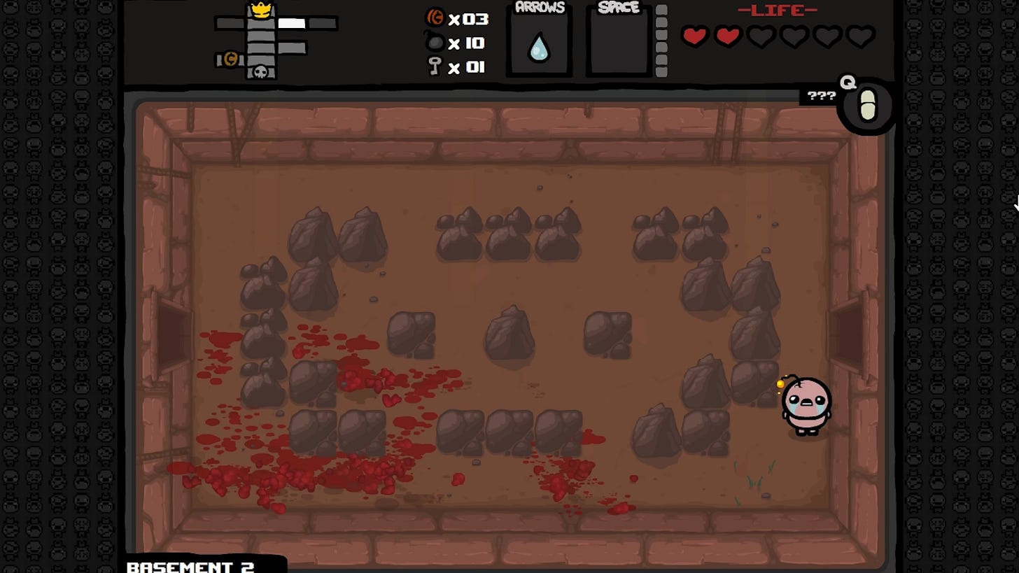
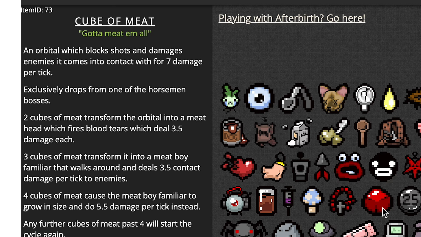
So this basement-dwelling dungeon crawler is packed with powerful items and upgrades… but the game doesn’t tell you what they do. They just have a name, or a cryptic tagline, or maybe just three question marks.
The game’s designer, Edmund McMillen, did this on purpose to create a feeling of mystery, similar to the sensation he got when playing games as a kid - like the original Legend of Zelda. He described that game by saying “You weren't sure what things did until you experimented with them, and you had to brainstorm with your friends and put all your findings together in order to progress”.
And so to mimic that mysterious sensation in Isaac - the items are deliberately left unexplained. You’ll need to pick things up, try them, and puzzle out their properties. Finding a new item should lead to curiosity, experimentation, and surprise.
And that worked… for about five seconds. And then people figured out what all the items did and put that information up on wikis and other websites. Want to know what a weird little thing will do? Just find it on Platinum God and mouse over it for a full description.
So, like Balatro - McMillen chose to hide information to create a certain feeling. But because that information is technically attainable - this time with a Google search rather than a spreadsheet - a number of players ended up playing the game in a completely different way than the designer intended. Arguably, a worse way.
And so after multiple DLC packs which added hundreds of new pick-ups, this has become, basically, the defacto way to play The Binding of Isaac. McMillen says “People would always say, "You can't play Isaac without a browser open on your phone." I hated that that's how everyone played for so long... and still play”.”.
In fact, he’s described the lack of item descriptions as the biggest flaw with Binding of Isaac. This design choice has basically haunted him in the years since Isaac’s release. And in a post in 2023, McMillen has said that he’s considering finally adding item descriptions into the game as an optional feature. Perhaps deciding that it’s better to support them officially, than players having a worse time with your game because of the way you designed it.
And I wonder if something similar might happen with Balatro.
Now, I don’t think the two examples are exactly the same. I agree that Balatro is more fun to play without score previews and I’ve never once thought to pre-calculate a score in the 30-odd hours I’ve played the game. This issue only really affects a small portion of the game’s most hardcore, strategy-minded audience. But over time, as the game’s long tail stretches out, I think this decision might come to haunt the developer, just like Isaac’s item descriptions.
But, if you’re watching LocalThunk, I think there are ways to provide this as an option to these players… without spoiling the game for everyone else.
For one, a score preview is only needed by players who are incredibly invested in the game, so the option could be granted as a late-game unlock - and not as something you can switch on from the word go. Kinda like, I dunno, how Chrono Cross has a fast-forward button, but it only unlocks after you’ve beaten the game once.
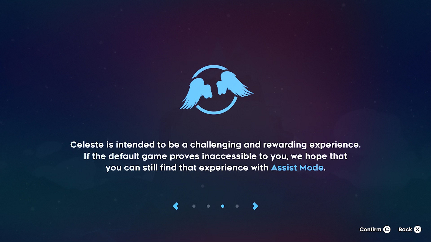
The option could also be clearly communicated to the player - like how Celeste prefaces its powerful assist mode with a message that explains who this option is for. Or how Heat Signature politely asks you to not turn off permadeath, please, it’s there for a reason.
Or Balatro could open itself up to mods - so users can hack their own score preview into the game, without the developer needing to officially support it. This is actually what happened to Isaac - the ‘External Item Descriptions’ mod is the most popular Isaac add-on in the game’s Steam workshop, with almost 2 million subscribers.
That’s not great for console players, though. So it could instead be provided it as a cheat code - so players have to actively seek this thing out, rather than stumble onto it as an innocuous option in the menu.
As I’ve discussed in my videos about accessibility - there are plenty of ways to open a game up to a wider audience, without necessarily spoiling it for the target group of players.
Whatever LocalThunk decides to do, this has proven to be a fascinating game design case study. About how you can change how a game feels, by changing how much information you give to the player.
About how players won’t always act in the way you want them to, especially if you leave open a loophole.
And about how the best intentions in game design sometimes have to change, when you see how players actually interact with your game.
I’ll be curious to see what happens with Balatro.

