
Can I fix Zelda's UI using Unity?
Making menus
Hey, it's Mark. So the latest Zelda game is wonderfully inventive, loads of fun, and - I say this without a hint of hyperbole - a crime against user interface design.
Here's the deal. Protagonist Princess Zelda can essentially save a copy of any object or item she comes across. Including bugs, bombfish, boarblins and bio deku babas. And then she can spawn that thing into the world, perhaps using it to solve a puzzle, or traverse across a gap, or create a little team of monsters to fight on her behalf. It's really creative and fun.
But the problem comes... right here.
This menu.
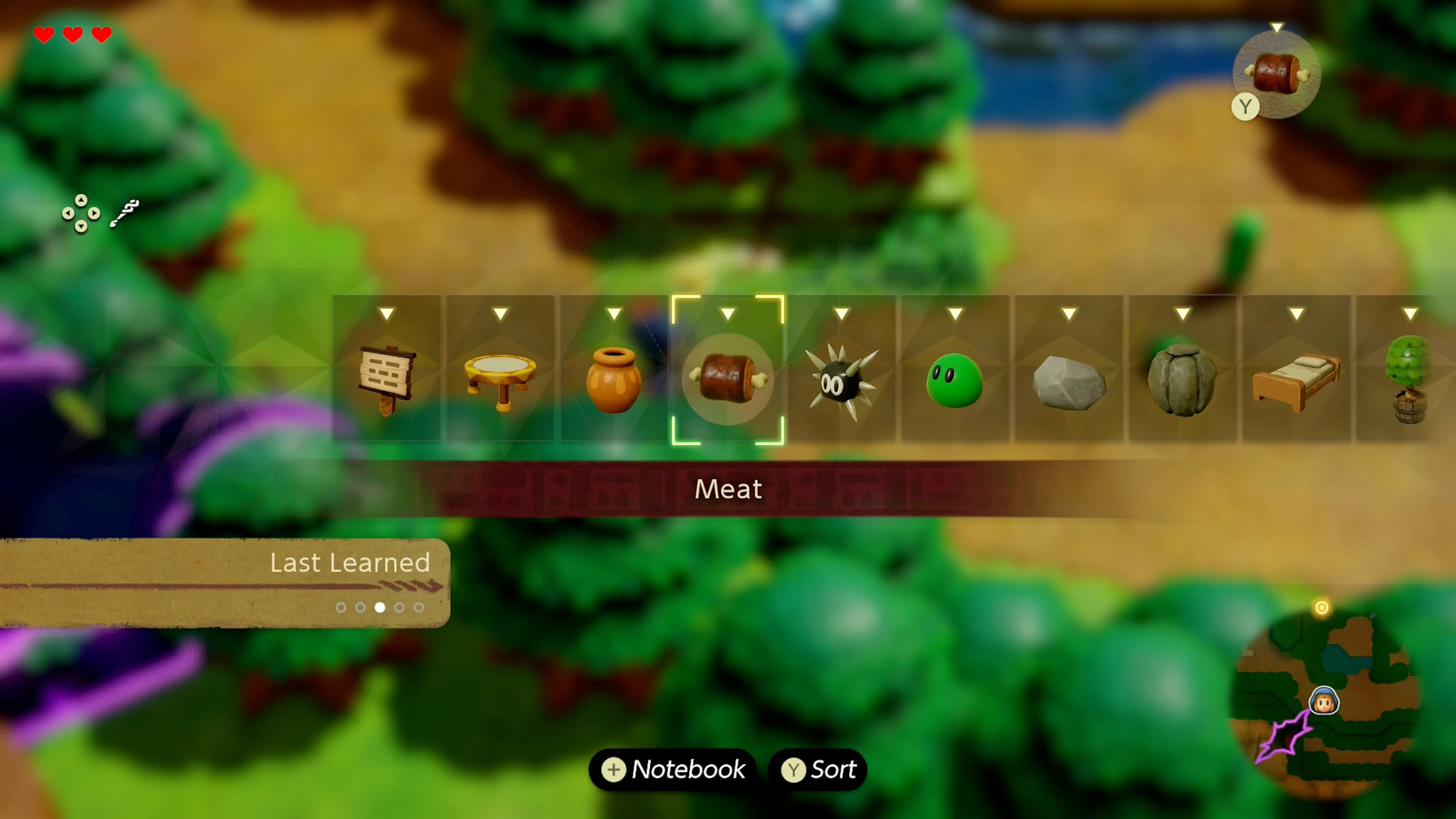
So to pick an echo - that's what these things are called, echoes - you hold the left bumper to bring up a list of all your collected objects and monsters. And you pick an echo from that list. And at the beginning of the game it's absolutely fine. Not a problem!
But! As you go along and find more and more and more echoes, they are simply added to the end of the list.
A single, gigantic horizontal line. Yeah. So by the end of the game - when you have more than 120 echoes - if you want to spawn in something new you'll have to go through a ridiculously long line of icons to find the one you want. It's mad! It was already pretty painful in Tears of the Kingdom, but it's even worse in Echoes of Wisdom.
And okay, you've got a couple things to help you. For one, the list wraps around on itself so if you're at the far right end you can instantly zip to the far left side. And you've got a few options to sort the list by type, last used, most used, last learned, and cost. But believe me - these things only help a little.
And, look, I'm not the only person to complain. Almost every review called out the game's crummy UI. And a few other people have already suggested ways to fix or redesign this menu.
But anyway - I got so annoyed with this menu that I thought, you know, fine, I'll do it myself. Could I make my own echoes menu that is more efficient and enjoyable to use? Well, let's find out. Together.
I'm Mark Brown, and this is Game Maker's Toolkit.
A quick note before we begin - the title of this post is, let's just say, YouTube friendly. Nintendo does not need me - a person with very limited game dev experience - to “fix” their game. So please take this as more of a fun design challenge, than an epic takedown of lazy devs. It's not that type of post. Okay? Cool.
Recreation
Right, so, the first thing I needed to do was to replicate the current user interface in Unity so that I've got something to work with.
For that, I would need images of all the echoes in the game. And the Zelda Wiki has the lot, and best of all, they're all transparent PNG files where the file name is the echo's in-game name, which will come in handy later. So I could just save the page in Firefox and get a handy folder with all of the images, and then drag those into Unity.
Next I made one of the little echo menu items, with some basic UI components.

And then I could duplicate that and change the image. And now, if I give these two objects the same parent and give that object the "horizontal layout group" component, Unity will neatly organise them onto a single line, with whatever padding I want. Neat!
I also made the cursor by using an image to mask out the four corners of this rectangle and it took me... way longer than it should have.
Okay, so it's time to code the movement.
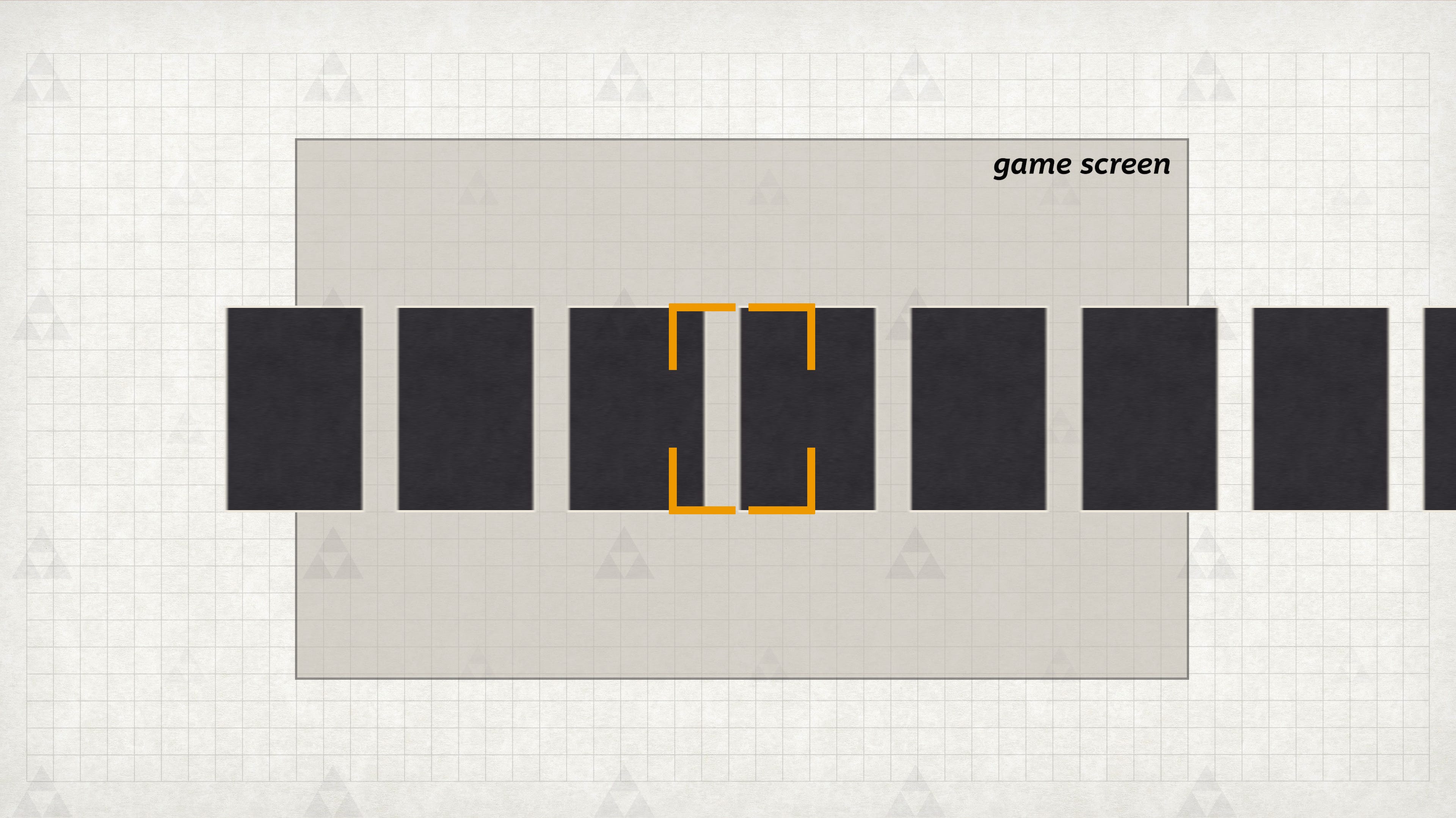
The idea here is to simply shunt the entire horizontal row left and right when the player presses the d-pad, which will push an echo into the cursor at the centre of the screen. And so if we move the row by the size of the echo plus the space in between, it will line up perfectly every time.
Of course, I'll need to account for the left and right limits of the list. So I can just keep track of which echo we're pointing at and if it's the first or last in the list, and you try to move beyond that, it will snap to the other end.
Now, I don't like how it just jumps from one item to another in the space of a single frame. That's ugly. So I used my all-time favourite Unity plug-in, Dotween, to add a little animation.
Now it slides from one echo to the next, like butter in a pan. And that's basically the movement code finished... but let's tidy this thing up.
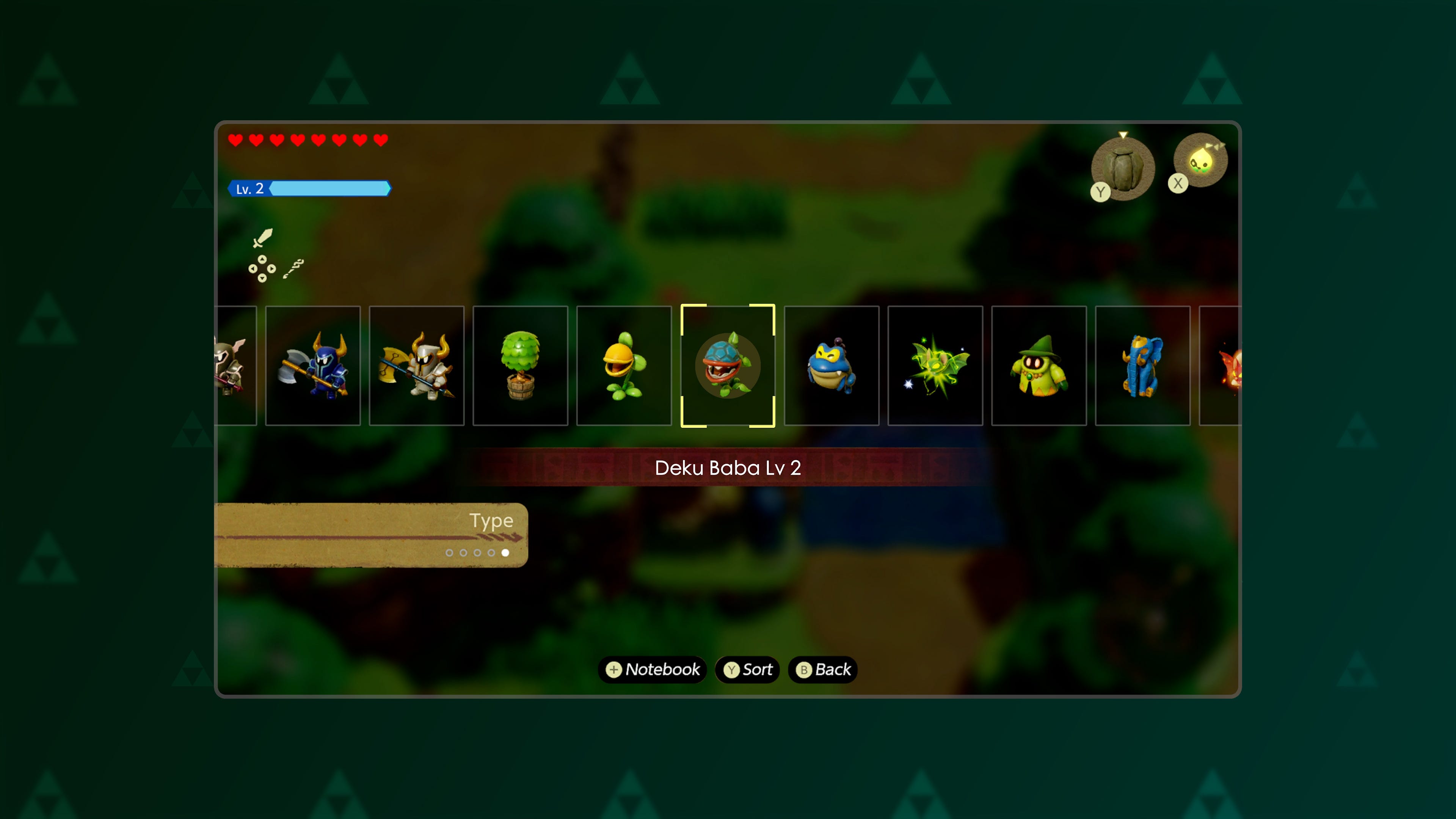
I captured some footage of the game so I could pinch some of the heads up display, like the heart counter, the XP bar, the controller icons, and the bar that goes underneath the echo name.
That allowed me to make a fake UI to slap on my scene, to make it look like this is actually part of the original game.
I could also put in the name of the echo. So when there's a new selection, I just take the name of the currently selected game object and put it on that label. That works! I just need to put in the rest of the echoes.
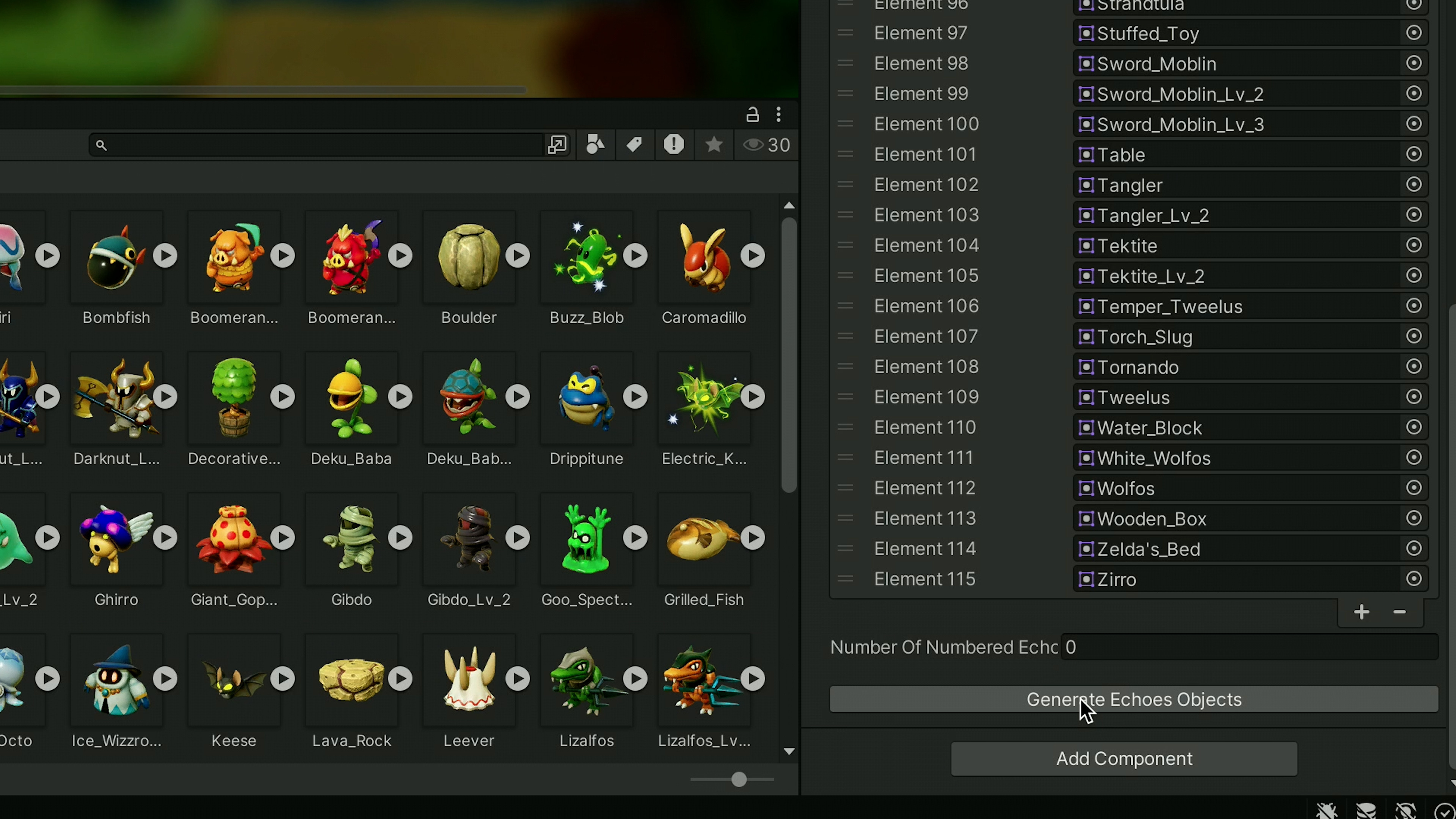
But you know what? I don't want to have to manually create every echo, add all the images, and type out their names. So I turned that first echo into a prefab and then wrote a script that would take all of the echo images and, for each one, create a copy of the prefab and automatically give it the correct image and name - using the image's file name.
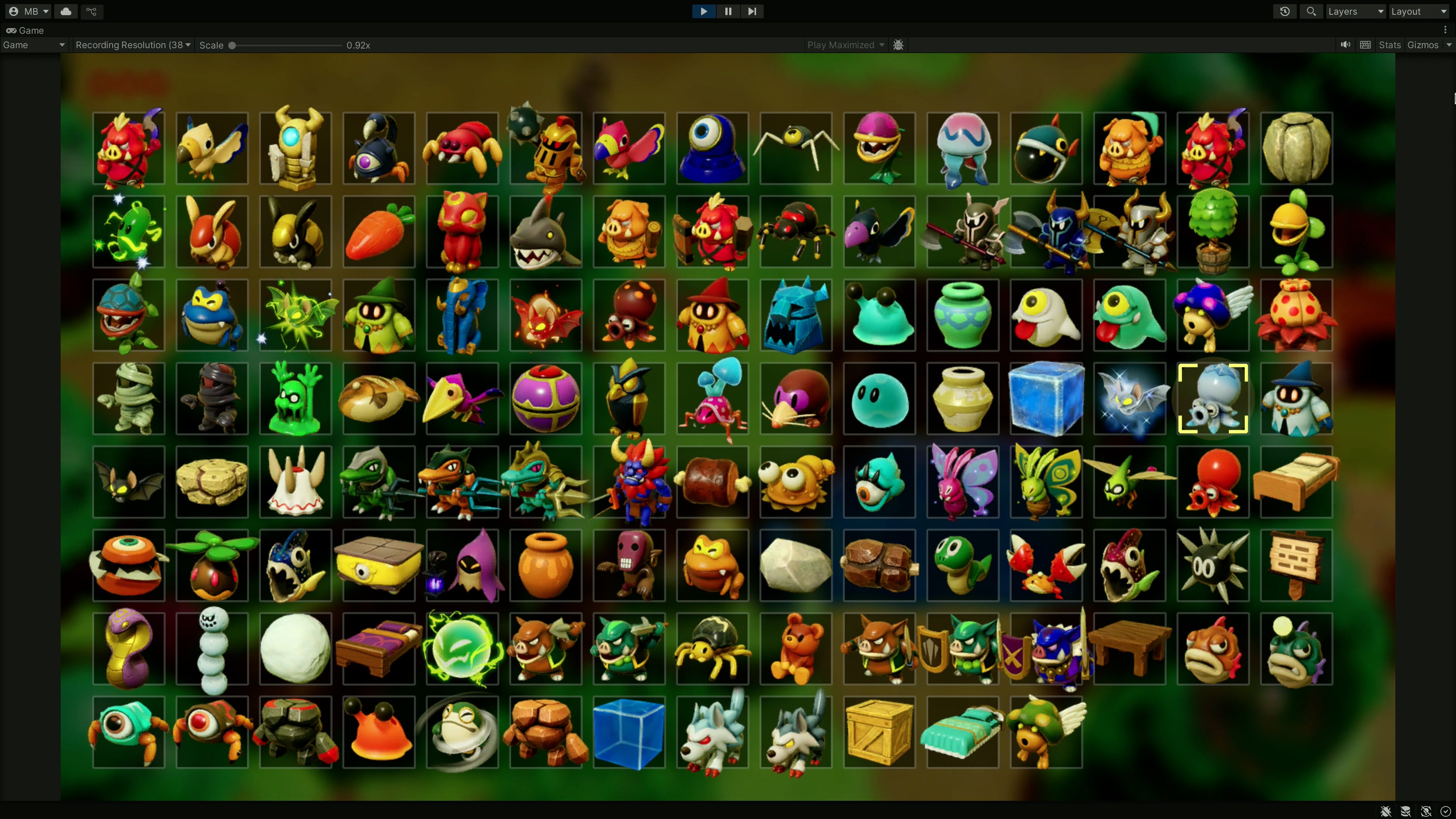
Now I can just click one button and, viola, I've got 100 or so echo game objects in my scene!
There were just a few other bits and bobs to fix. Like finding a better font for the label, and recording some sound effects from the game and putting those into the code. But with that, we're done.
We've got the Echoes of Wisdom UI working in Unity, and it's almost identical to the Switch version. But that's only step one - the next step is to ask, what can we do to improve it?
Acceleration
Okay, so first things first, let's not do anything too radical. Let's just try a quick quality of life hack - and that's to add some acceleration. You see, right now, when you scroll through the list it shifts along at the same speed no matter how long you've been holding down that direction. So how about we speed things up over time?
This was actually super easy to implement, thanks to Dotween. You see, when I shift the grid over I set how long it takes to move from one position to another. Which I set at about 0.1 seconds for the recreation.
So what I can do is have an acceleration number that builds up the longer you hold down a direction. And then if I take the animation's length and divide it by this acceleration number, you suddenly have a bar that moves faster the longer you hold the button down.
In fact, it's a little too fast and so it's hard to know where you are in the list. Especially when it automatically wraps around from one end to the other. So I added an indicator at the top that shows where you are in relation to the full list of echoes.
And you know what? That's not too bad. And it only took a tiny bit of extra code.
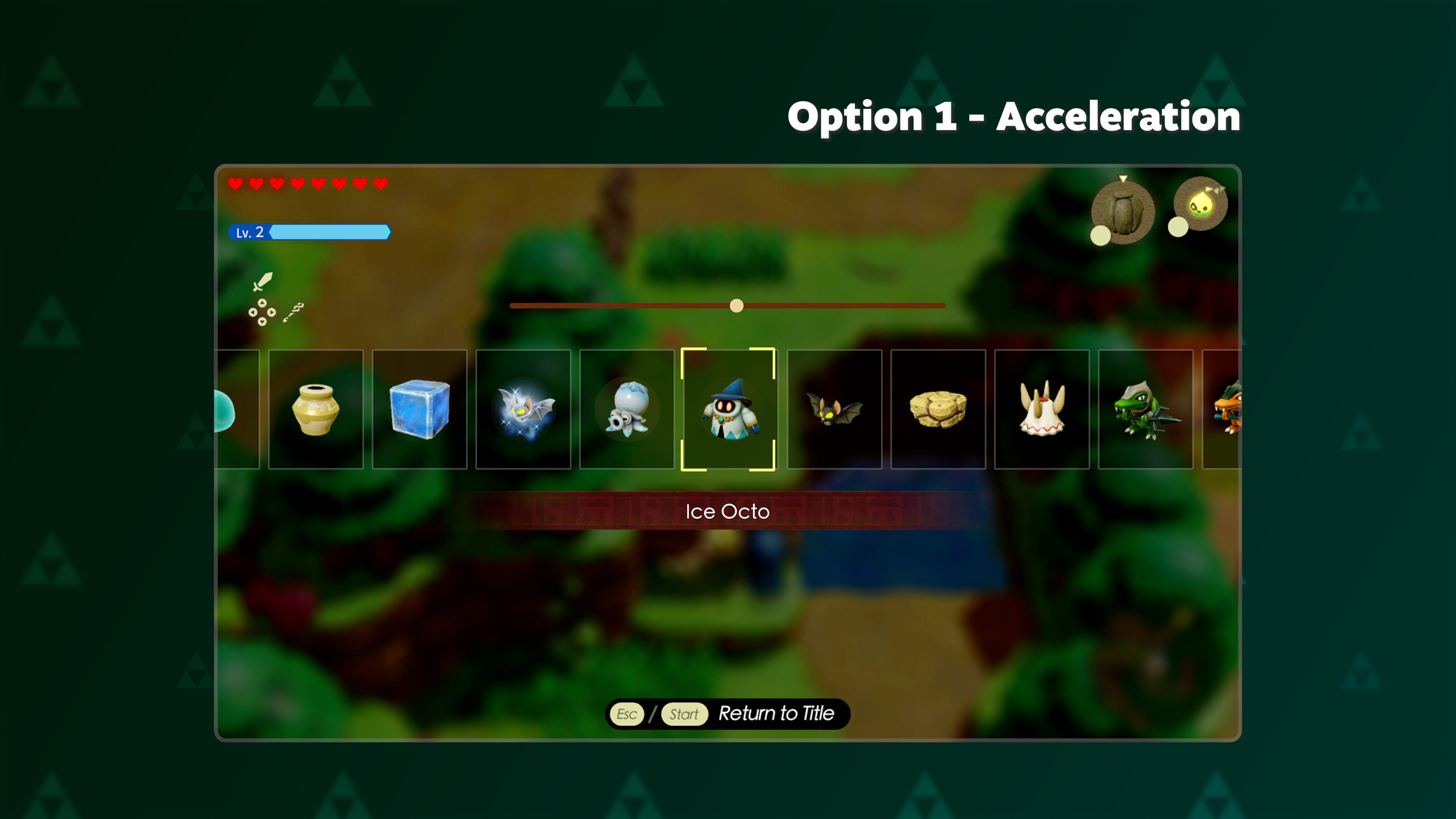
So let's call that option one... acceleration.
But okay, what else could we do?
Cross Media Bar
Well, the first thing I thought of was the PlayStation 3. You see, the console used something that Sony called the Cross Media Bar, or XMB, and it was actually pretty elegant.
Basically there's a horizontal bar for the top level categories like music, movies, games, and settings. And then each one of those items has a vertical bar for the content within, like your individual songs, films, and so on. Perhaps we could do something similar for Echoes of Wisdom?
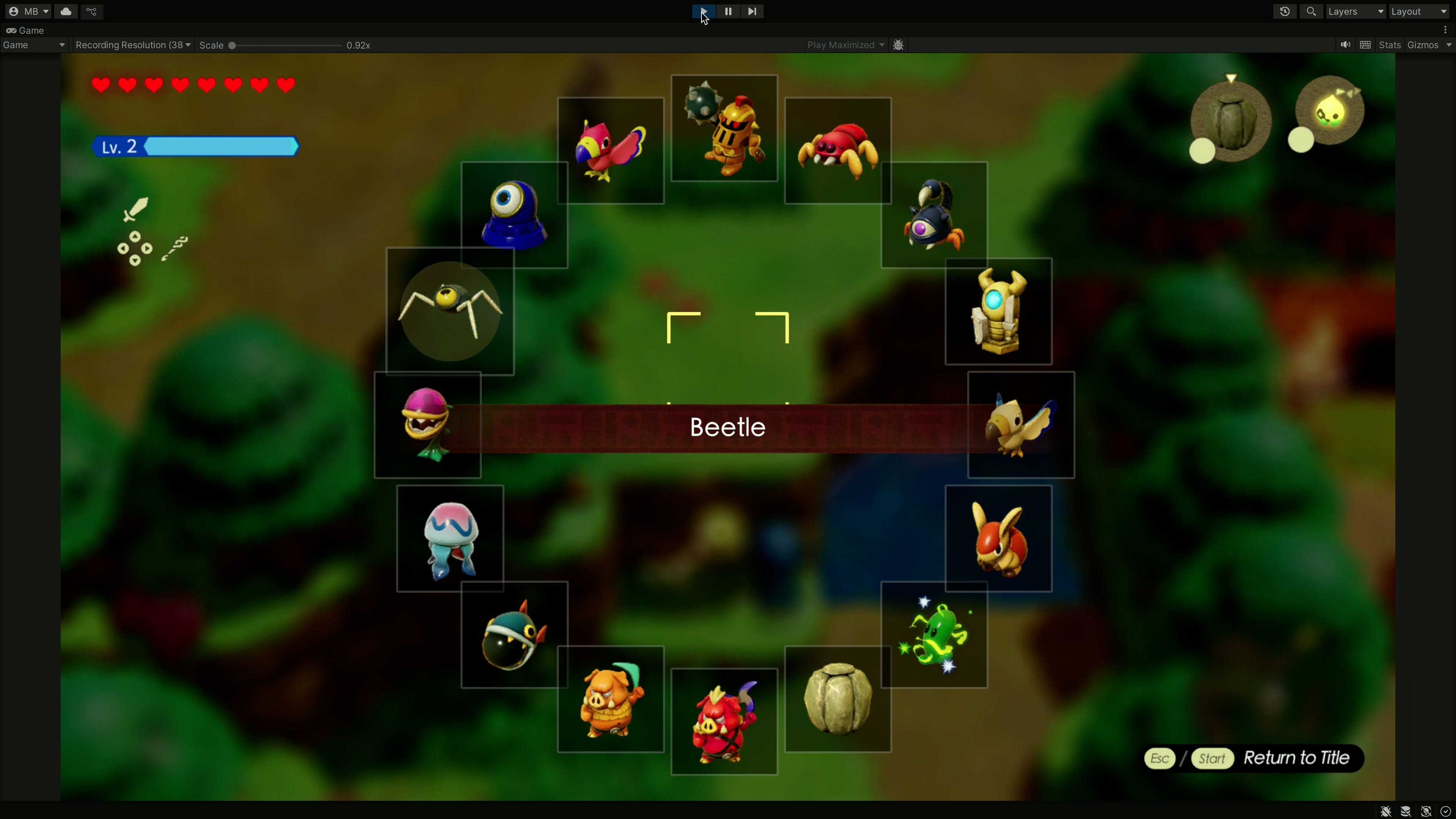
Because many of the echoes can be grouped together. Like the four animal statues from the Gerudo Sanctum dungeon. Or the various monsters with level 2 or level 3 versions. Or the monsters with elemental variants like the fire, ice, and electric keese.

So we could keep the horizontal bar, but have it splinter into vertical sections for certain echoes.
Setting this up was relatively easy because alongside the horizontal layout group, there's also the vertical layout group. And after a little jiggery pokery, I was able to nest a vertical group inside of my original horizontal group.
Just like before, I'm going to shift the entire vertical object up and down when the player inputs a vertical direction. And for this to work, I created holder objects for the vertical columns, and gave them a distinct tag called "vertical". Now, when the player hits up or down, it will only try to shift the object if it has that "vertical" tag.
I then had to spend ages putting all of the echoes into sensible categories, but in the end I managed to compress the horizontal line down from over 100 echoes to just 55. That means you can scroll through the list in about half the time!
It's also nice because the list remembers the vertical positions of the columns, so your favourite, say, Lizalfos, will stay in the central spot and can be gotten to very quickly.
Now, it's a little overwhelming to see so many icons on screen at once so I added a dark shadow over the top to obscure the ones that are above and below the main horizontal line.
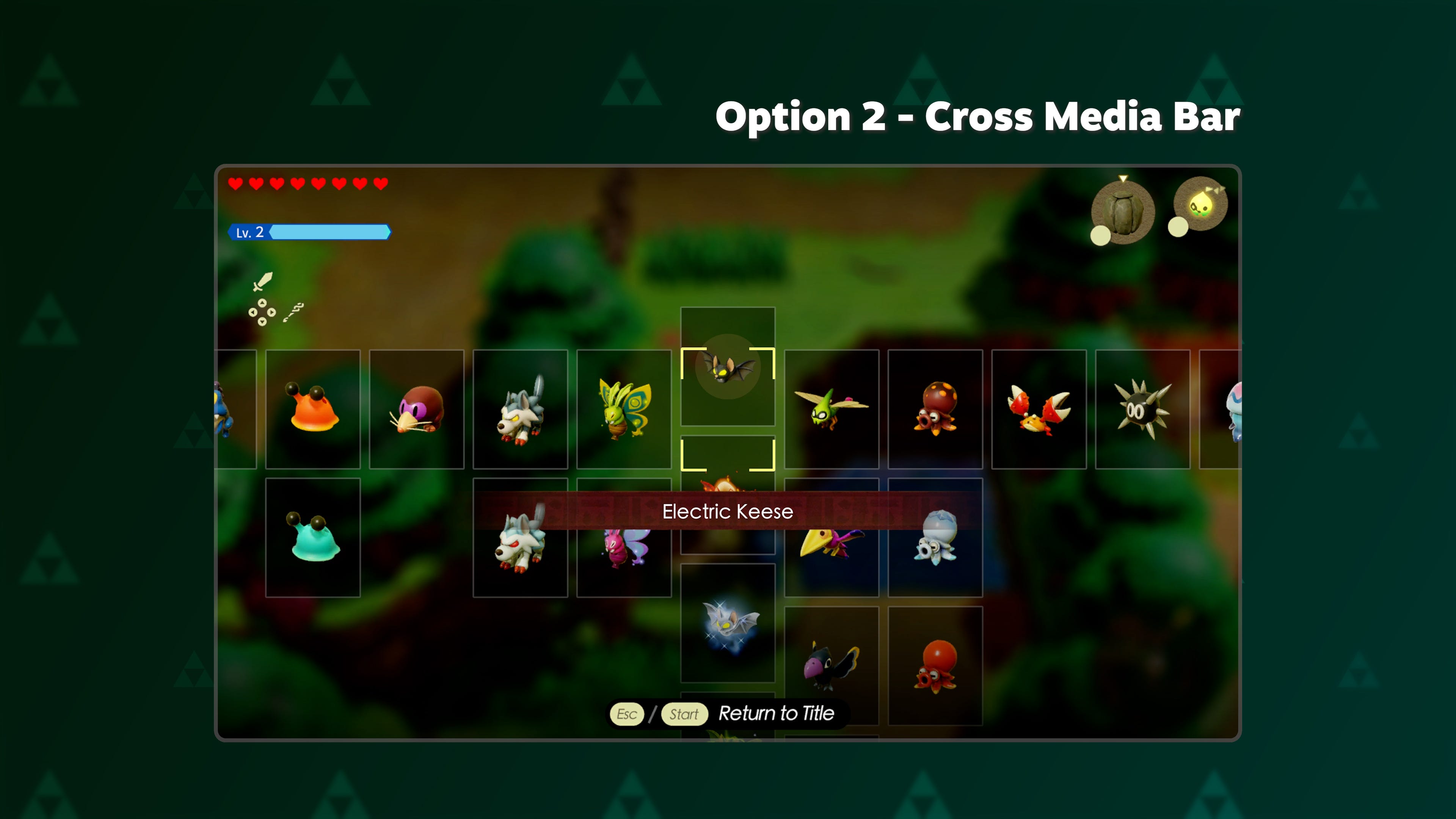
But with that done, we're finished. And that's option 2 - the cross media bar variation!
Grid with tabs
Okay, so before we move on, I should come clean. Zelda does actually have a second way to pick echoes. You can open the notebook and pick them from this grid.
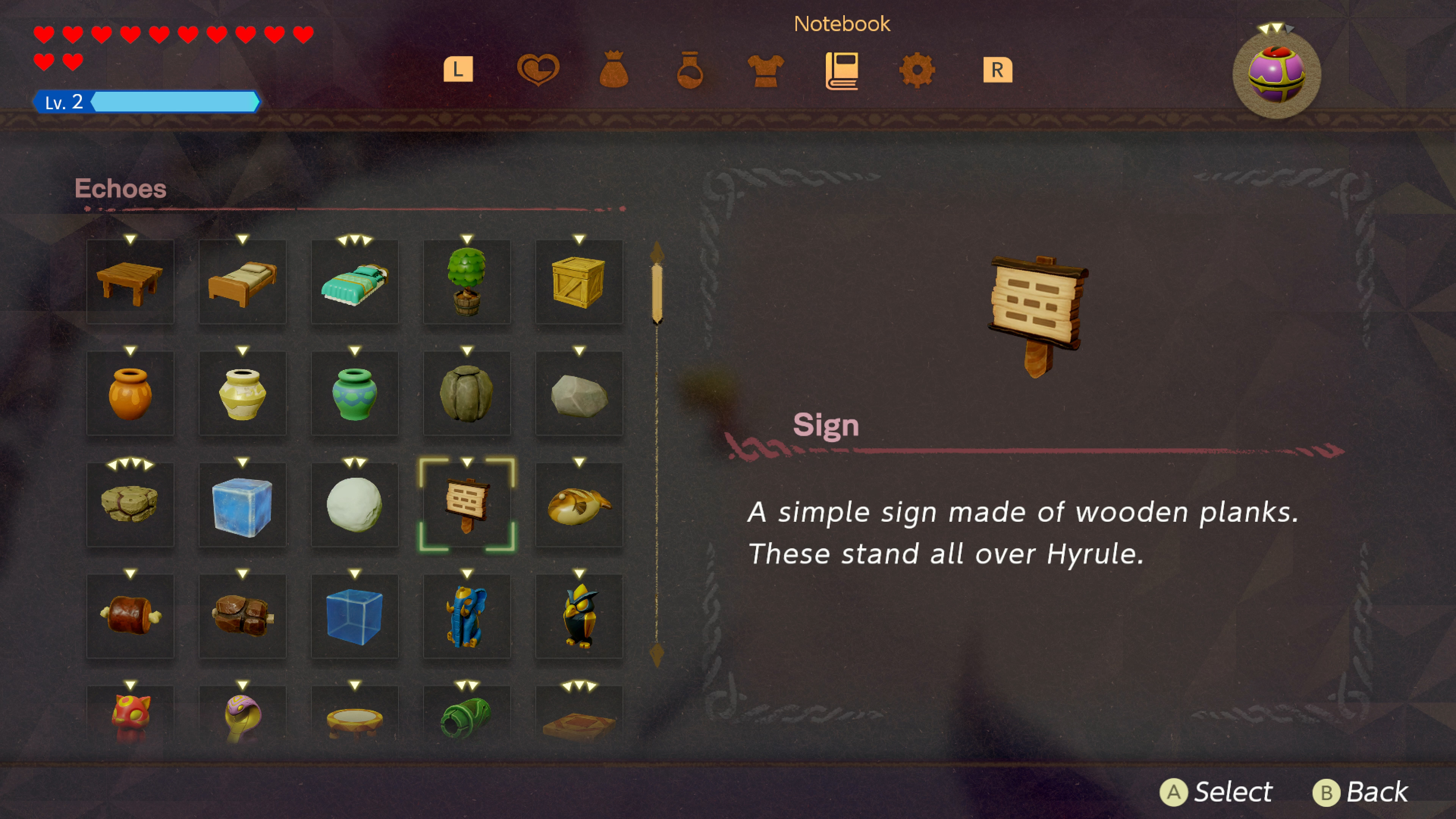
Now this isn't so convenient - you have to pause the game, and the game might be on a different tab like equipment or potions so you've got to switch to the notebook. But it is at least faster to navigate by virtue of being a grid with five columns, rather than one row.
But, you know what, I still want to improve it. Because, for one thing, this is a vertically oriented list on a game you play exclusively in landscape mode. So that's wasting some screen space. Let's start by turning it on its side.
Luckily, this was very easy to implement - because alongside the horizontal and vertical layout groups, Unity also has a handy grid layout group which works on the same concept. Any child objects will be neatly aligned to a grid, and you can even decide how many rows and columns there should be.
But we can do more than this, I reckon.
So I took some inspiration from another game with a big inventory of items to pick from... Minecraft. I mean, this game has a lot of stuff. As of the latest updates there are more than 1000 objects and when you're in creative mode... you've got access to all of them. So Minecraft offers lots of ways to sort through this stuff including nested lists and a search box.
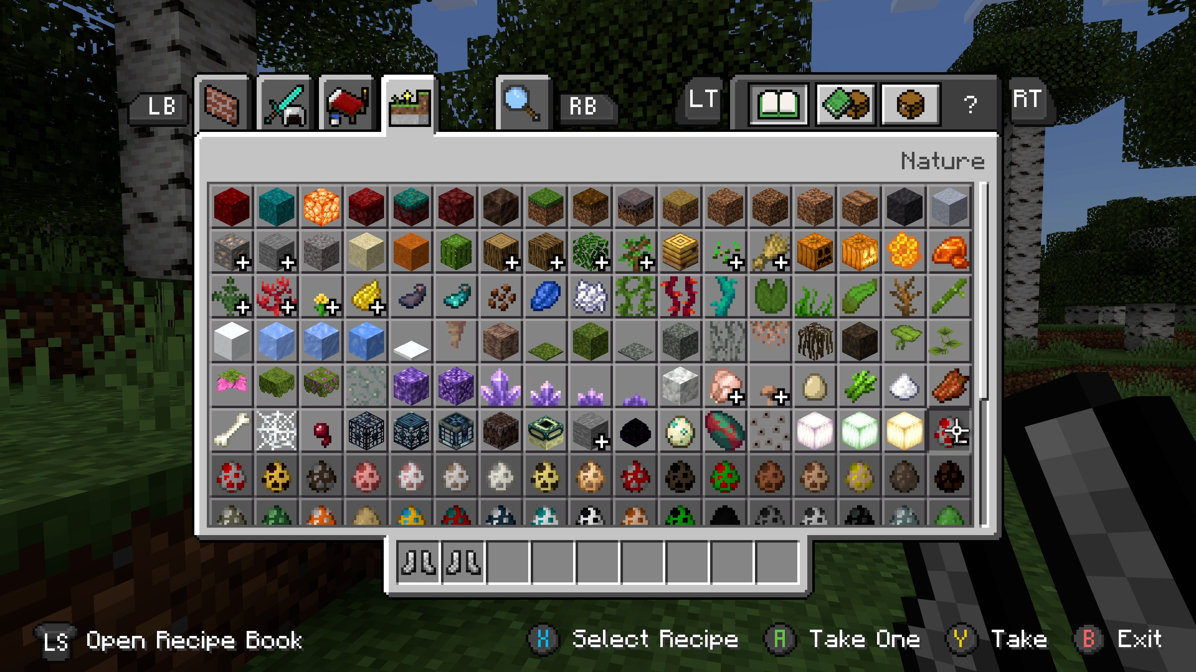
But the thing I'm interested in is the tabs... it's a nice idea to sort the stuff into categories so there's only a limited pool of items to pick through at any one time.
So, back in Unity, I put the echoes into five different lists. One for objects, one for birds and ghosts, one for water and ice monsters, one for creatures, and one for soldiers and the like. Don't worry too much about the specifics - it just meant that a list can have 36 echoes on screen at one time, without the need for scrolling at all.
Then I wrote a script to keep track of which tab you are on, and to cycle through them when you press the right bumper.
Now, ideally you'd have two buttons, so you can choose whether to go to the tab to the left or right of your current option. But remember that in Zelda you have to hold the left bumper down to keep this echo list open. And so I thought it would be more comfortable to have just one button, to go the tab on the right. And because there are only five pages, it's pretty easy to get to the page you want, even if it's literally one tab to the left of where you currently are.
So that works. But right now it doesn't look too nice to simply hide the current tab and then instantly show the next one. So I used Dotween again in order to fade out, and slightly move the current tab before fading in the new one.
It's super subtle, but it's enough to suggest flipping through pages and I think it looks pretty polished.
Finally, we need a little bit of UI to show which page we're on, which I basically stole the game's sorting filter thingy.
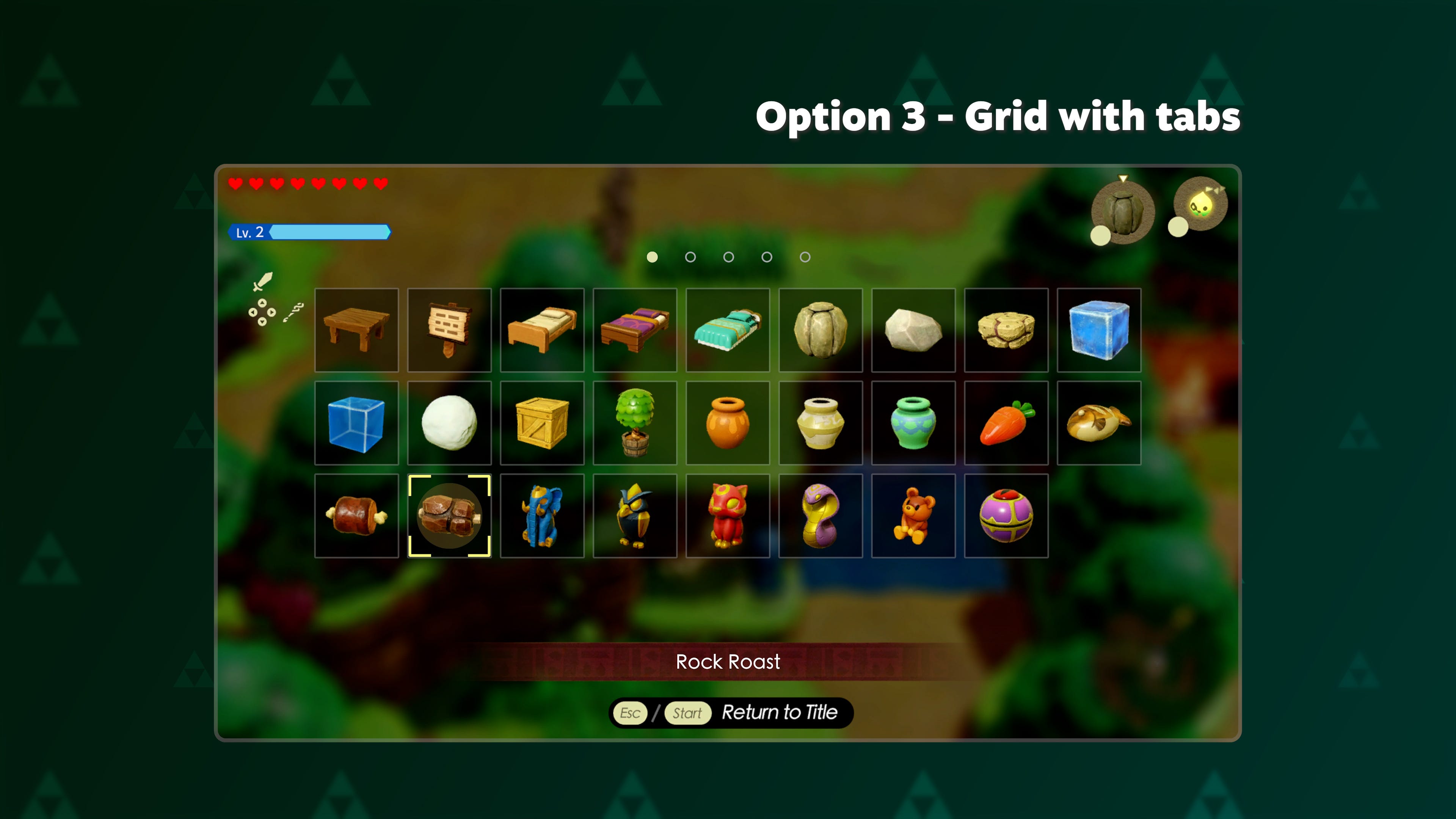
But with that done, we've got option 3. The grid with tabs, or pages. I think it works nicely. But there's one small problem with it.
Radial Menu
So, the problem is... well, unless we shift our thumb down to the d-pad, then we're going to be navigating this thing with an analogue stick.
We're taking a grid - something that is very digital, you know, all right angles and straight lines. And we're controlling it with something designed for, well, moving a chubby plumber in 3D space. If you've ever tried to type on a virtual keyboard using an analogue stick, you'll know it's not a great fit.
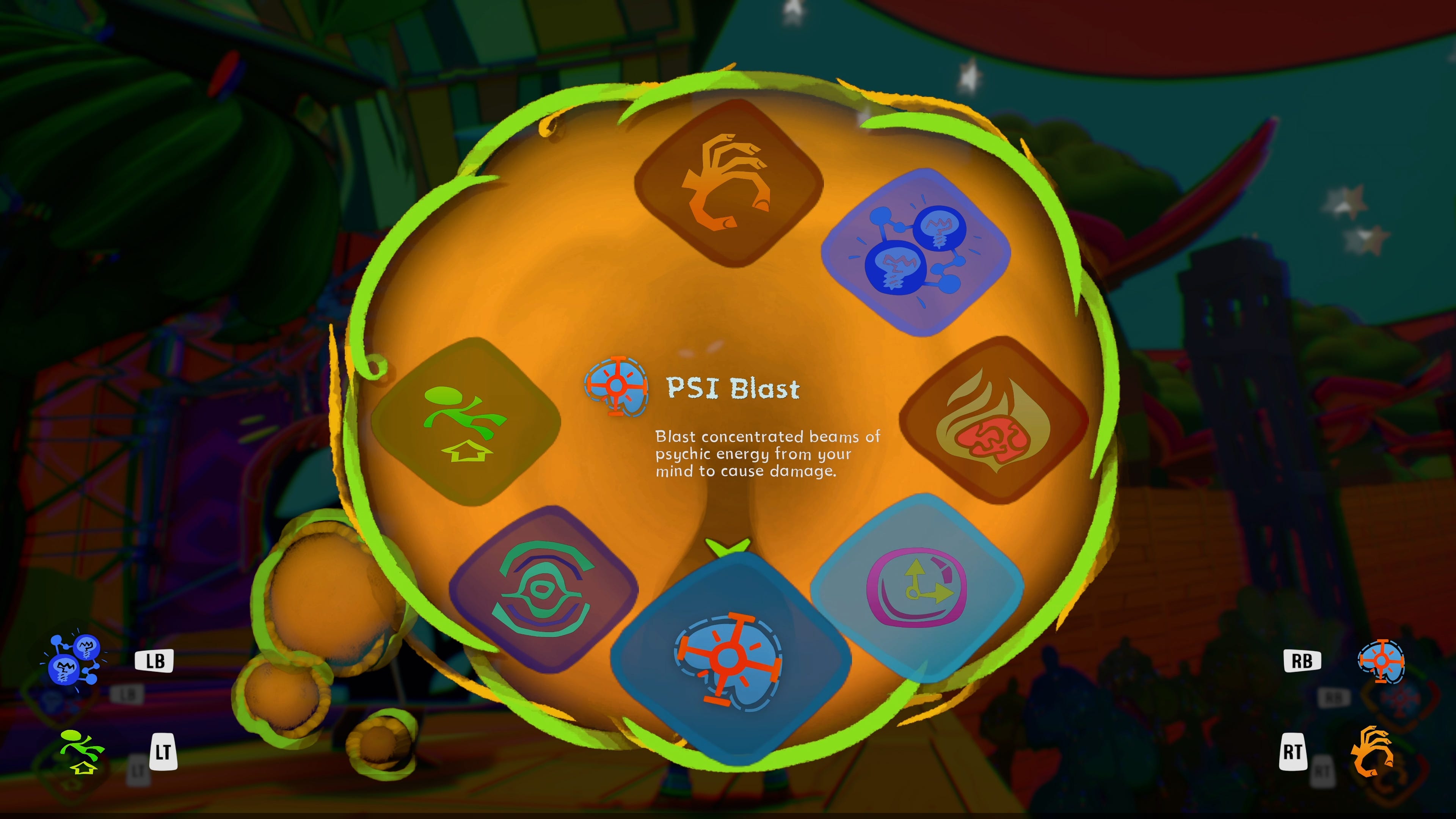
So that's why many games on console opt to use a radial menu, with the idea that the menu is essentially on a ring around the outside of the analogue stick, and we can select different options by merely pointing at them. It's very elegant, very functional. And so... could we implement something like for Echoes of Wisdom? Let's give it a go.
Okay, so Unity sadly does not have a radial layout group. So we'll have to make that one ourself with a bit of tricky maths that puts each echo on the correct spot around a circle.
And then we can translate the angle of the analogue stick to the angle of the circle to select and highlight the echo that is at that position. Which all works remarkably well.
We'll just need to fiddle with the UI to put the name of the echo in the middle of the radial menu. And change the cursor script to follow the currently selected object, rather than stay put in the centre of the screen.
But, with just a small amount of code that works really nicely. It's just that there is, as I'm sure you've noticed, a slight problem. And that is the fact that we've only got 16 echoes on screen right now. And... it doesn't work quite so nicely with 116 echoes.
Yeah. Oops.
But, okay, you could potentially have this work as a sort of "favourites" bar. Kind of like Animal Crossing where you have a whole grid for your current inventory... but you can also set some tools as favourites and they'll show up in one of the 8 spots on the easy-access tool ring.
And I think that would totally work.
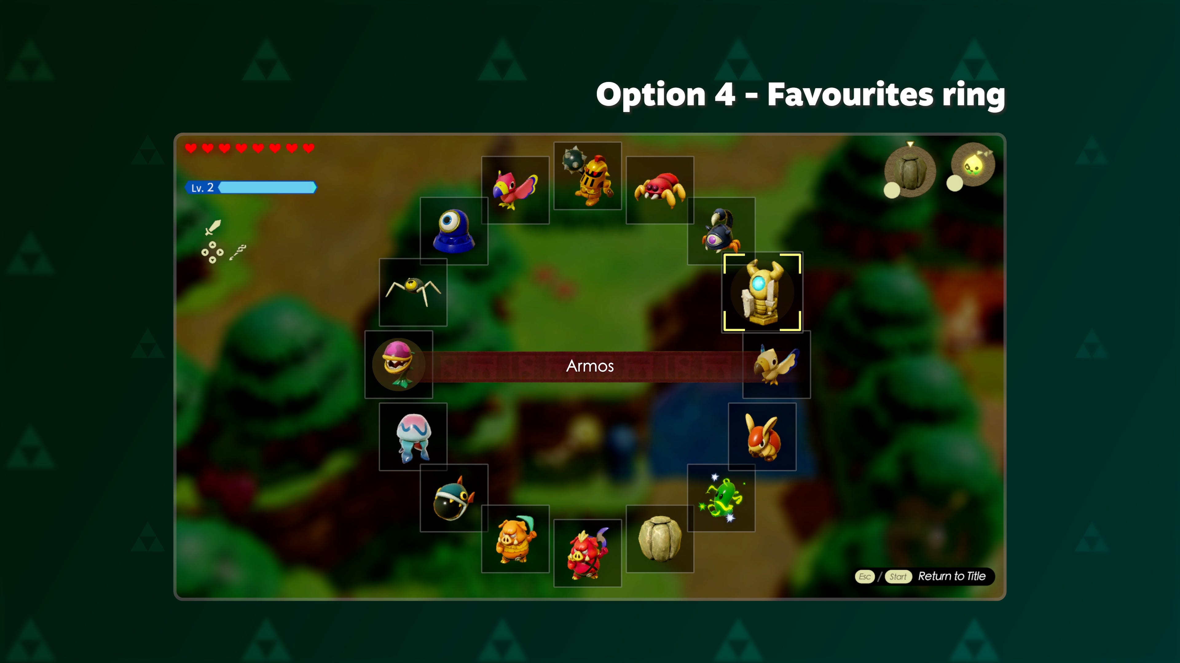
Let's call that option 4 - the favourites ring. Except... it totally goes against the intended experience of the game.
You see, while I was working on this video, I tried to find out why Nintendo would implement a system that is, in my opinion, obviously bad. And, you know what? They actually do have a pretty interesting reason. In an interview with the BBC, co-director Satoshi Terada says
"One of the essences of this game is being able to figure out different ways of using each of these echoes. And so in that sense we wanted players to fall upon and see the echoes that they may not have noticed or have been using while they're sorting through all the echoes that they have."
In other words, while you're slowly bumbling through this crappy UI, you might spot an interesting echo you hadn't thought of using for your current situation. The UI is designed to make you less efficient, but more creative.
Now... that's kinda galaxy brain. Though I'm not sure how well it worked - for me, the prospect of navigating that list was so off-putting that I actually did just stick to the same few creatures. But fair enough.
If Nintendo doesn't want you to just use a few favourite echoes... then having a literal "favourites" ring would fly in the face of that ideal. So let's keep thinking.
Spiral Menu
Because you know what? I think we can still have a radial menu, without reducing the number of echoes on it. One solution could be Super Mario Maker 2's menu system, which operates on a series of different radial menus that you can jump between using the left and right bumpers. And that could totally work.
But forget that. I want something even better than that. Something way more ambitious. And way more goofy.
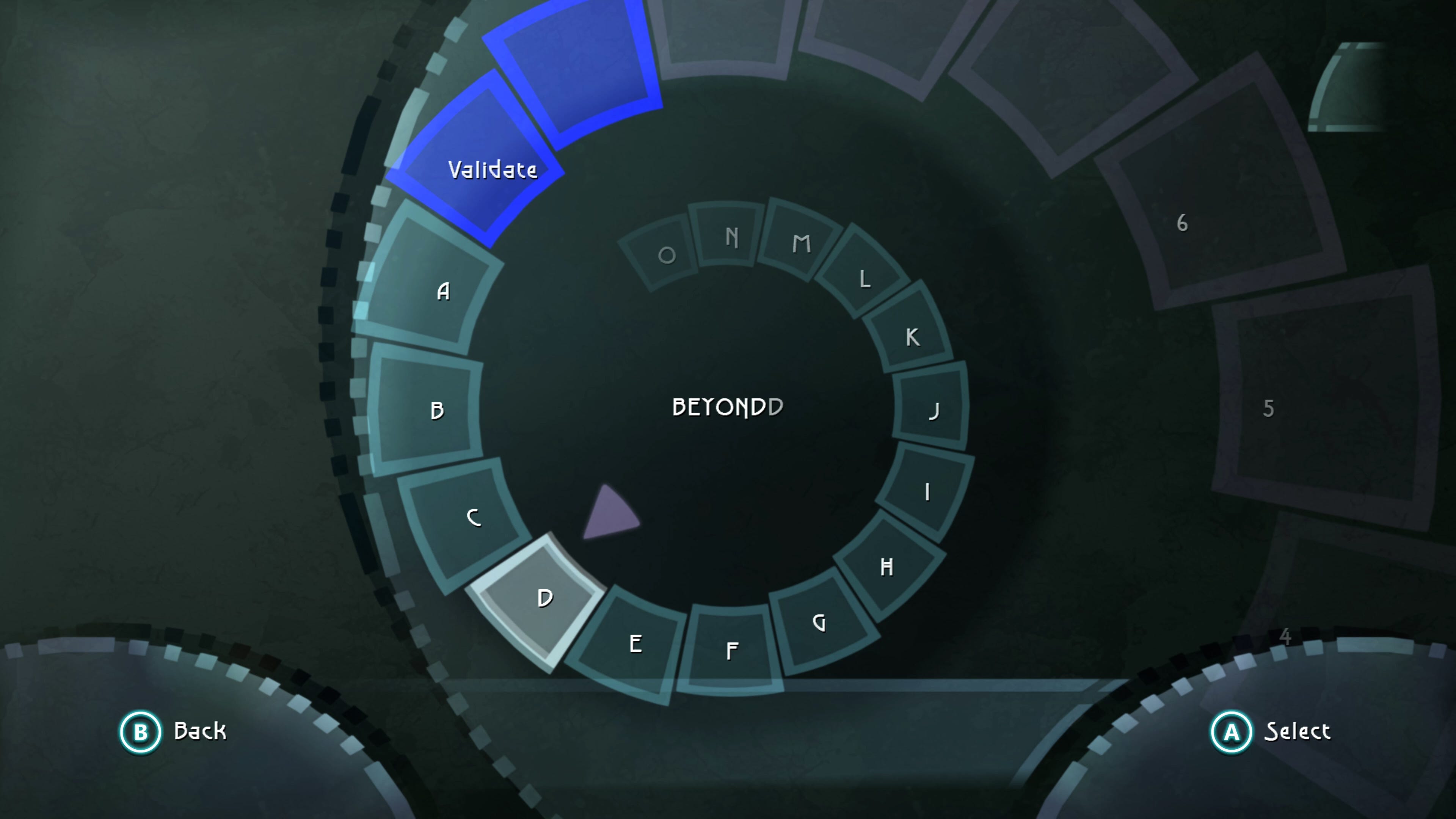
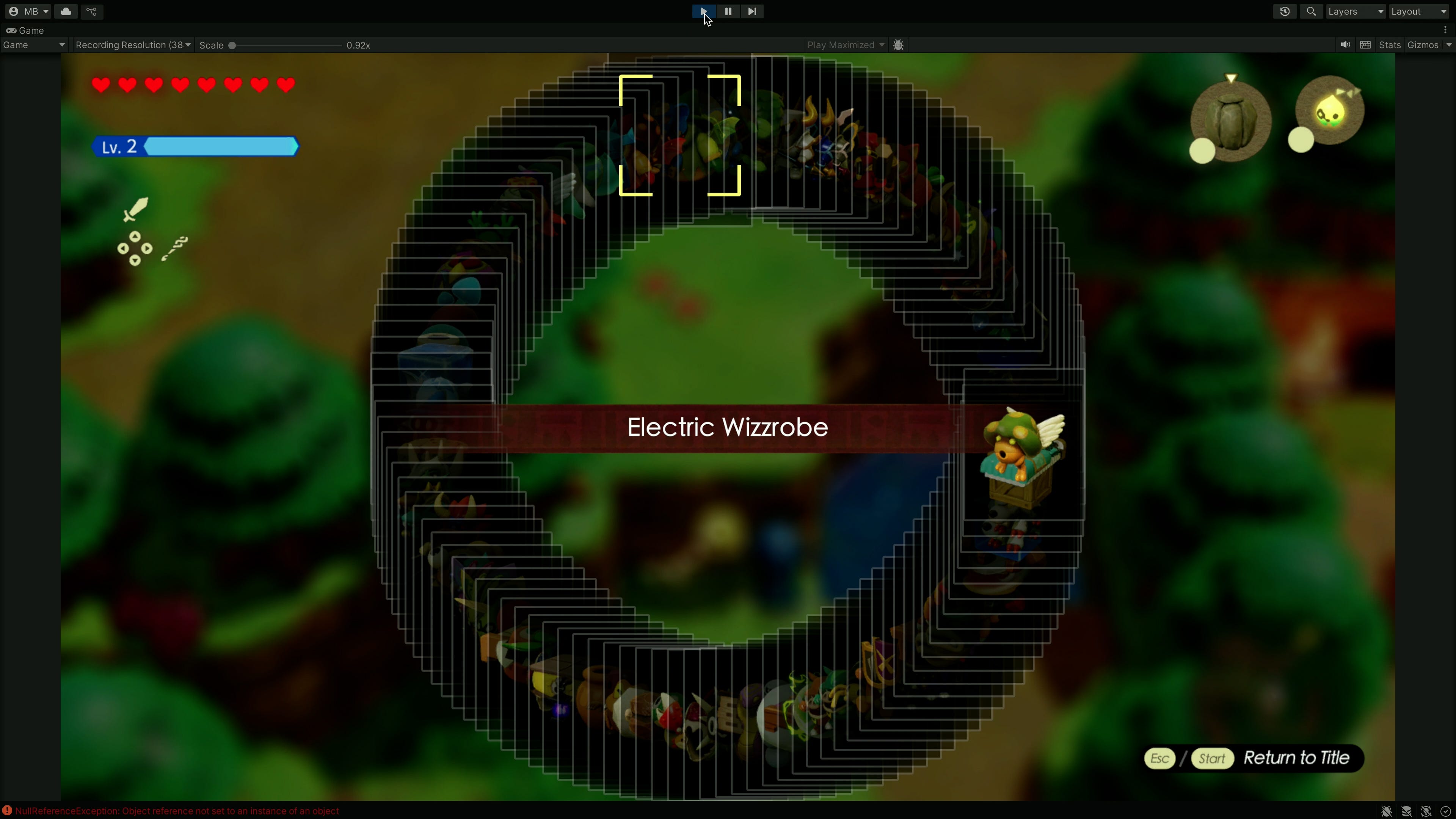
I want... the Beyond Good and Evil spiral staircase keyboard system! Yes, this is a hilariously over-engineered solution but it is genuinely cool and legitimately quite fast to use with an analogue stick. It basically has all the benefits of the radial menu, but can hold many more items than can be comfortably shown on screen at once. So... how can we make this thing for ourselves?
Well, after a few false starts. Okay, many false starts. Plus some help from the GMTK Discord. After all of that and plenty of trial and error, here's what I came up with.
So, we basically take that same code that puts the items into a circle, but now we let the circle loop around on top of itself a bunch of times. Like a coiled snake.
You know what? We can see this more clearly if we also increment each echo's Z position... See? It creates a crazy spiral staircase. But this is only a 2D game, so we need to crush it all down to only happen on a single flat plane.
Then, just like before, we use the analogue stick's angle to pick out an option on the circle. But now... with so many echoes stacked on top of each other... well, Unity has no idea which one to pick, resulting in this nonsense.
So, to fix this, we should only enable the echo we are currently selecting, and then a few echoes to the left and right of that one. This way, only a few echoes exist at a time, and so Unity has no problem knowing which one to pick from. We can even see this happening in the hierarchy, as only a small chunk of objects are enabled as we move up and down the stack.
To sell the spiral effect, we can also apply some transformation to the echoes near our current selection. We can shift their position, and change their size, and transparency. This creates that stepping effect, and makes it look like the echoes are rising out of the screen.
And with all that done we get the final version... which is, wow, it's kinda fun! What I like is that it basically has the acceleration concept from option one, but we're controlling that ourselves, simply by how fast we spin the stick. Wheee! It's a little hard to know where you are in the spiral, but you could always add the scroll bar from the acceleration demo...
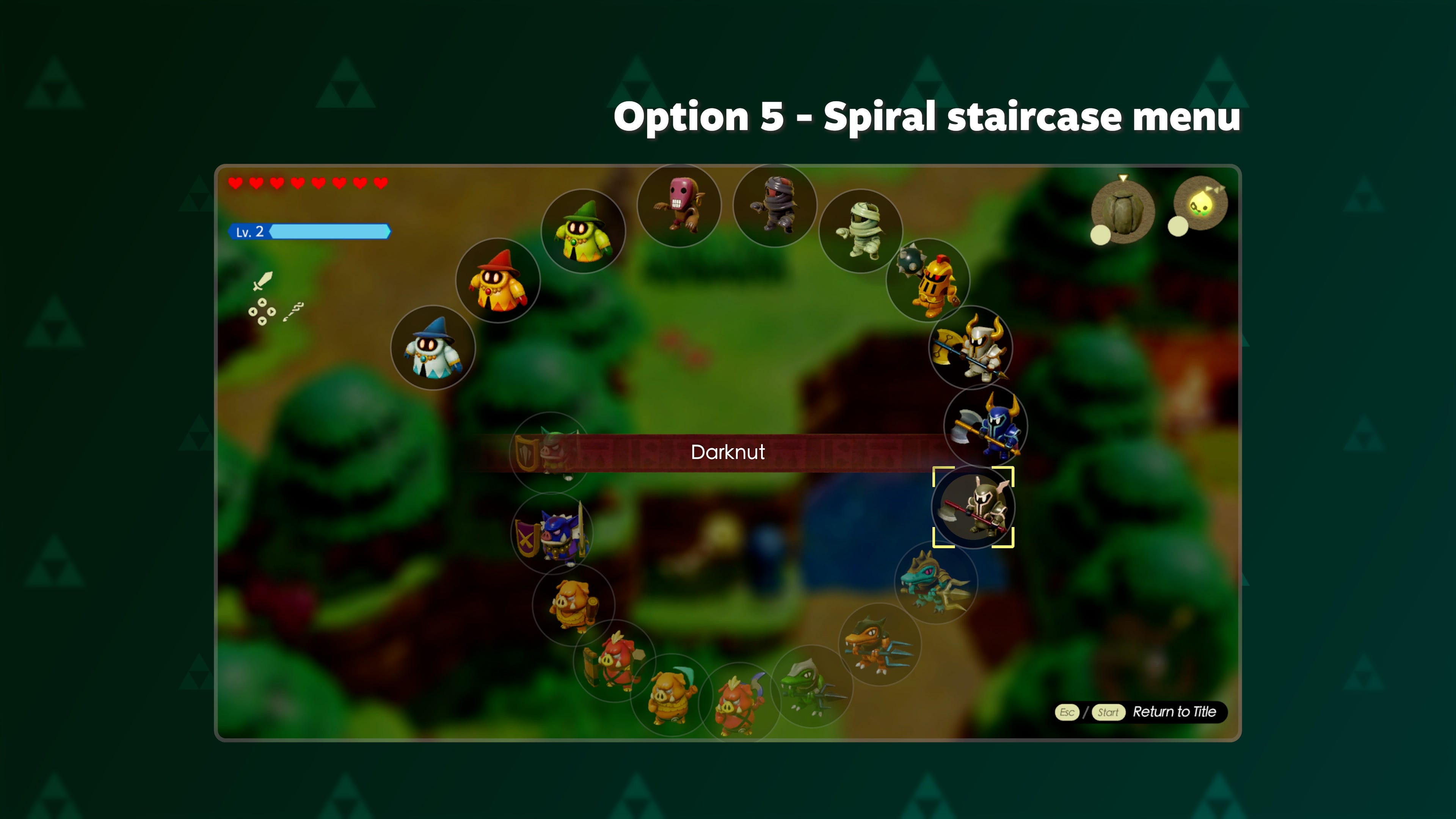
But either way, this is option 5, the spiral menu.
And so those are the five options I wanted to explore.
We've got the menu as it exists in Echoes of Wisdom. And a version where the list gets faster the longer you hold down the button. We've got a menu with both horizontal and vertical bars, inspired by the PlayStation 3's cross media bar. We've got a bunch of grids, split into separate tabs, akin to Minecraft. We've got a radial menu to hold our favourite Echoes, like in Animal Crossing. And we've got a crazy spiral staircase that spins in and out of the screen.
Each one has its pros and cons. But which one should Nintendo have used, if any? Well... you tell me!
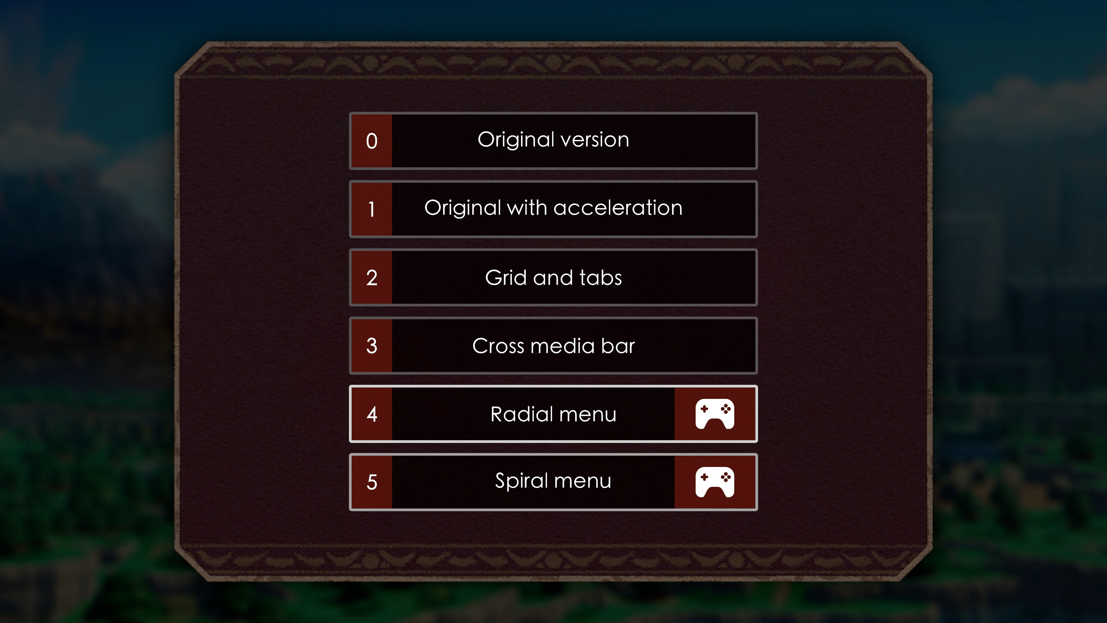
I've put them all together into a little interactive showcase on itch, which you can play, for free, in your browser. You'll need a controller for the radial and spiral menus, but the others will work with a keyboard. So let me know which one you like best in the YouTube comments. And suggest any other ideas you might have for how to improve the menu.
Oh, and if you're a GMTK Patron, you can get the whole Unity project file with all the code I wrote. A special shoutout to the 49 new Patrons who have already shown their support in 2025 - thank you!
Hey! Here's one more tidbit.
So, how come Princess Zelda finally got to be the protagonist of the franchise that, well, has had her name on the box for 30 years? Well, like most things at Nintendo this was a case of form following function.
You see, for a long time during development it was assumed that Link would be the hero of the game, just like every other Zelda entry. But as this was shaping up to be a game about spawning in monsters to fight on your behalf... well, that wouldn't really work if you had a sword and shield. Why not just kill the monsters yourself?
So Nintendo had to either come up with a reason why Link could no longer hold a sword, or just pick a different protagonist who isn't known for wielding a blade. Hence: Princess Zelda.
It was still tricky to figure out why Zelda would go on the adventure herself rather than just send some Hylian guards, but that was easier than justifying a sword-less Link.