

Developing: How I made my game look GORGEOUS
Polishing world one of the rough draft
In pretty much every episode of Developing, I make some embarrassing mistake, or have to throw out tons of work, or just generally have a bit of a breakdown.
But not this time, no. This month, things just went really well, and so I get to be like a real-life game dev YouTuber, and just show off a bunch of cool stuff I made in the last month. It's a Christmas miracle!
Okay, so last month went well. Like really well.
I talked about how I created a plan for how to finish the game, which was essentially a complete overview of the game. The worlds, the levels, the mechanics, the story, and so on. Basically like a bullet point layout of the entire game. And then from those bullet points, I was able to make a sort of rough draft version of almost the entire game.
Now, like I say, it's super rough. All of the levels look like blueprints, a lot of the stuff is using placeholder graphics, the story isn't implemented at all, and most of the levels still need some tweaks and adjustments.
But it did at least allow me to see the game as an entire, finished product. And made me realise that, yeah, I'm actually pretty happy with this! And so now, my job is to take that rough draft and make it into the real deal.
That is of course a huge job, but here's one of the benefits of working on a game that split up into nice, evenly-sized worlds. I can break the job up into chunks. So my job for November was to take just world one of the rough draft, and make it real.
Here's how I got on.
Level Design
Step one was to finalise the level designs.
The rough draft had most of the levels done, but they still needed some tweaking based on playtester feedback. Sometimes the solution was to just move some objects around to make things more clear or simple. But that wasn't always the solution.
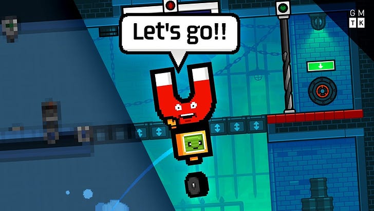
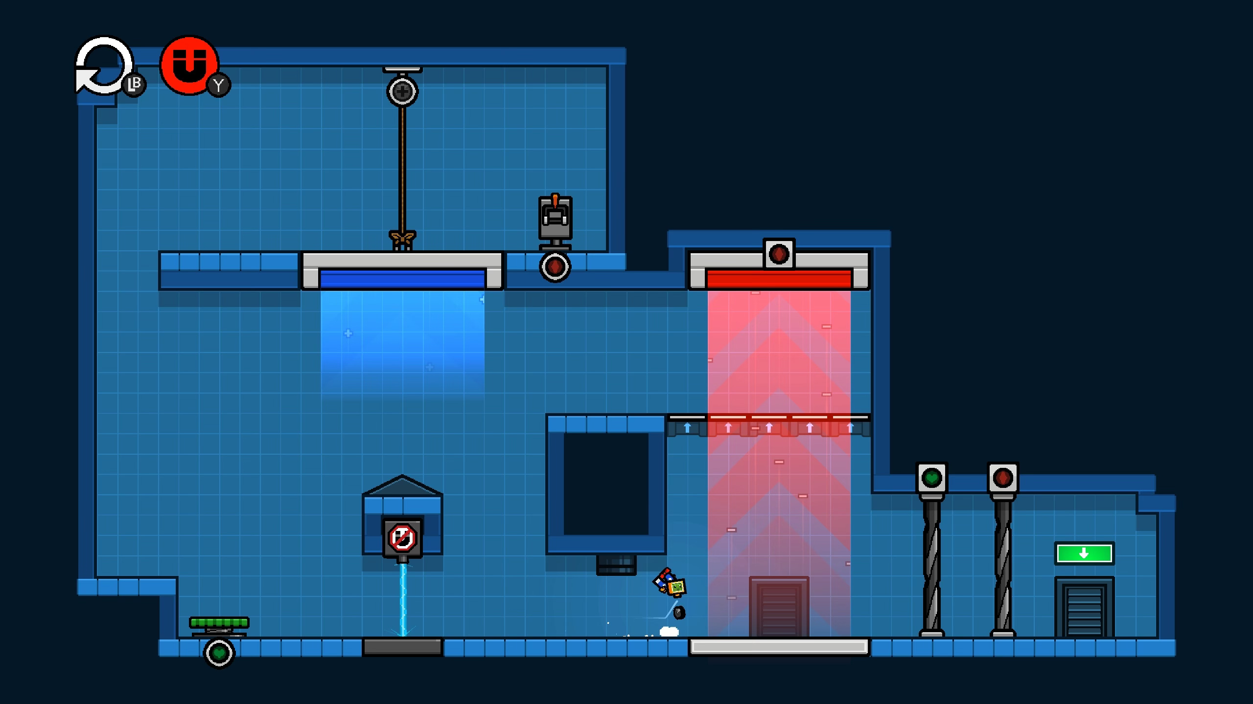
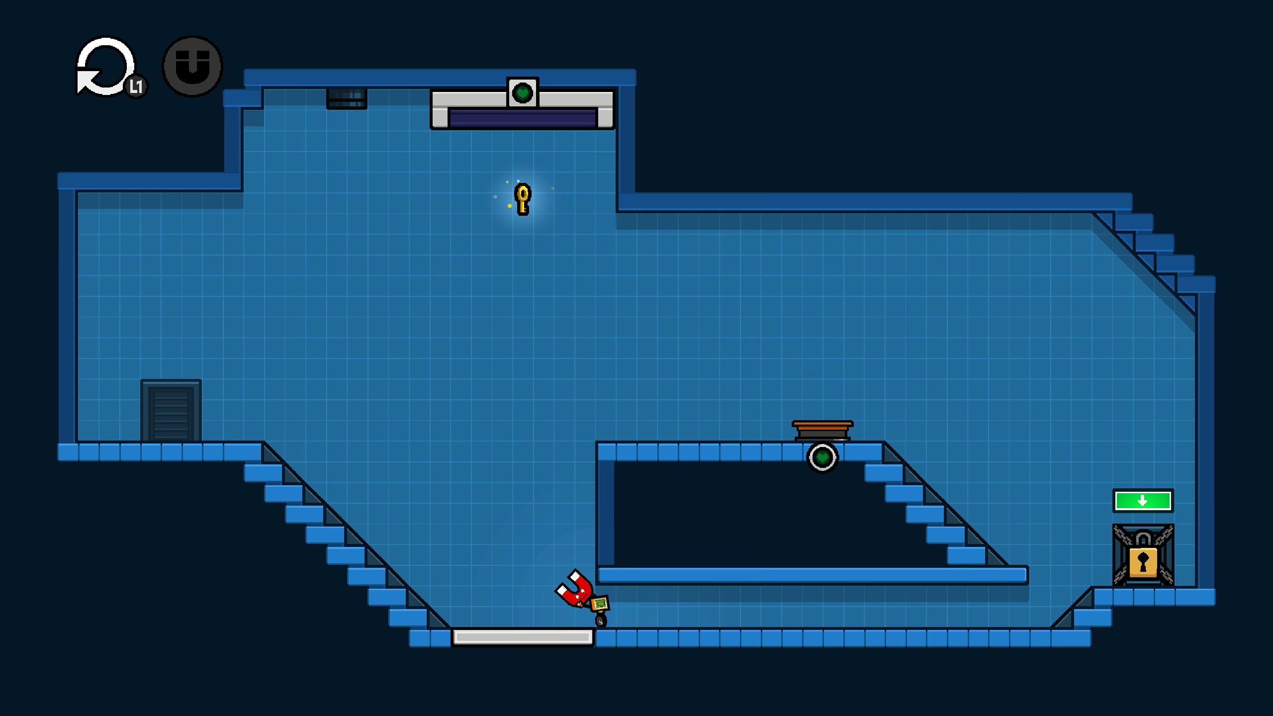
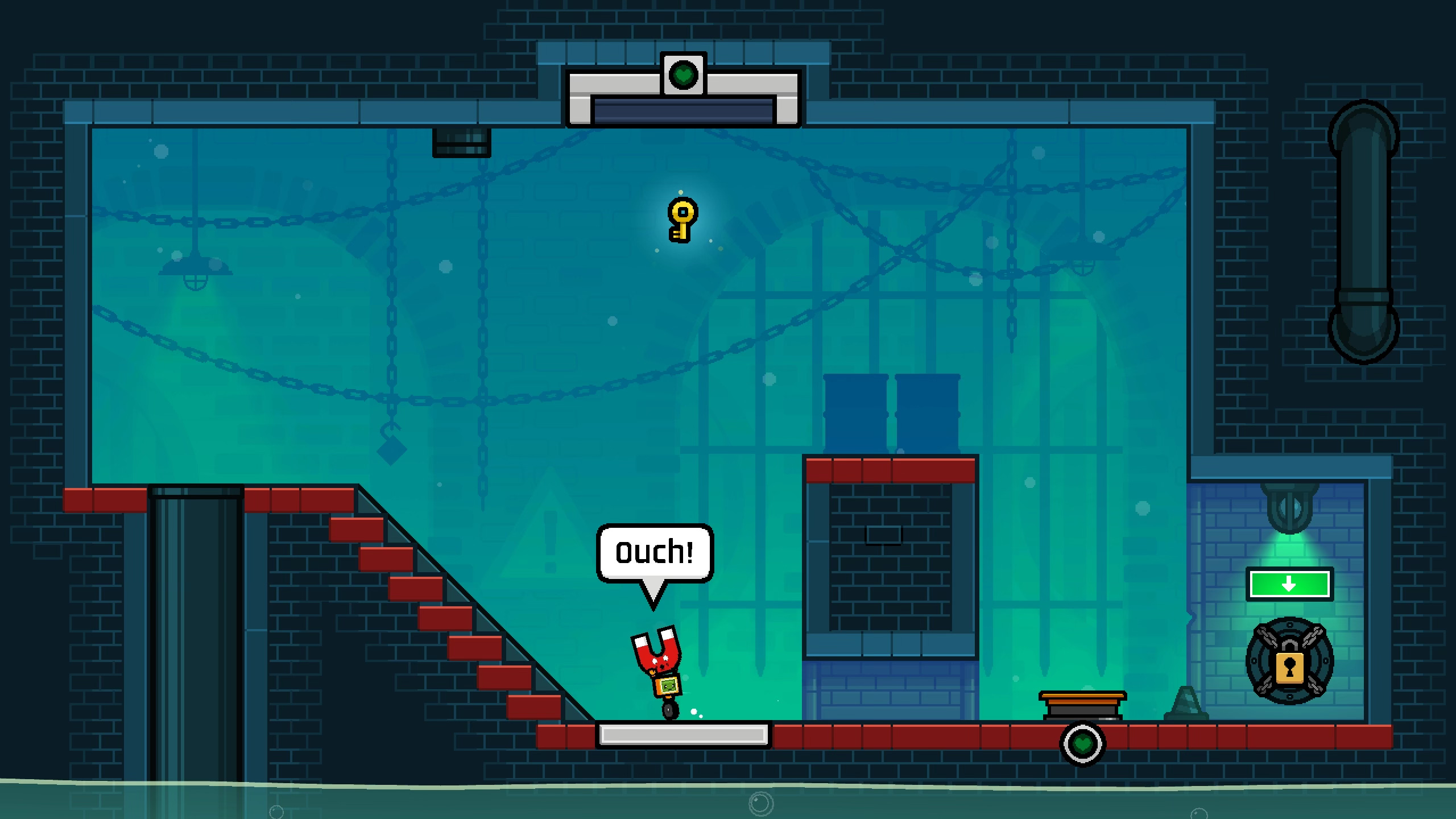
Like, take this level. You've just got the first magnet in the game, and you're introduced to one of the game's central mechanics - using a magnet to ride up to a higher platform.
So you grab Magnus, and ride up the magnetic field to grab the key on the left. But how do you get to the door on the right? It's too far to travel across.
Every single playtester I gave this to couldn't figure it out. That includes two professional puzzle game designers who both skipped this puzzle. And this was baffling because, to me, the solution was simple. I never even thought of it as a tricky puzzle. It was more of a tutorial than anything. But people were stumped.
Here's all you have to do. Turn the magnetic field off. Take the magnet to the right. Leave it. Turn the field back on. And then go get the magnet, and ride up to the door. Huh. Talk about challenging your assumptions about your players, right?
But okay, there's obviously some conceptual block that needs to be cleared. I thought I could fix it by putting a suspicious lump on the right side of the screen to suggest where to put the magnet, but alas, no. That didn't work.
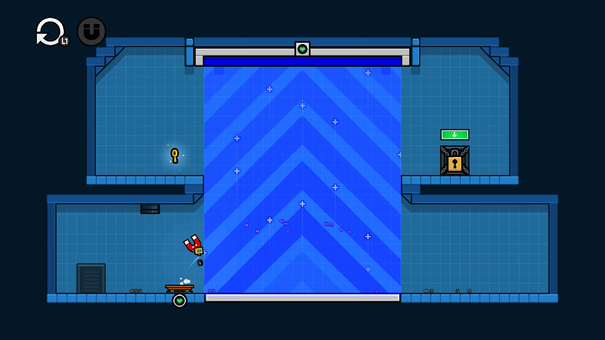
But then I thought about the next level. In this one, the magnet is too big to get through a gap. But if you leave the magnet behind, it gets pulled up by the magnetic field before you can grab it.
So, after a little confusion, players realise that they need to make sure the magnet is safely stashed somewhere else, and then correctly place it on top of the slope. Then they go get it after the field is turned on. That they get.
So I changed the level order. I made a new level where you simply ride the magnet up twice. Then there's the level with the too small gap. And then I bring back the perplexing stage. I gave it to some playtesters, and... Hooray. They got it.
Thanks to the new knowledge gained in the previous level, they realise that they can leave the magnet in other places, and use that to solve the stage. Perfect.
Now, it's obvious that players need to be taught a mechanic before giving them a puzzle on that mechanic. But it was only through playtesting that I realised that leaving the magnet behind is a mechanic, and that this level is a puzzle.
But anyway, after a bit more back and forth argy-bargy with my playtesters, I had my finished collection of level layouts.
Visuals
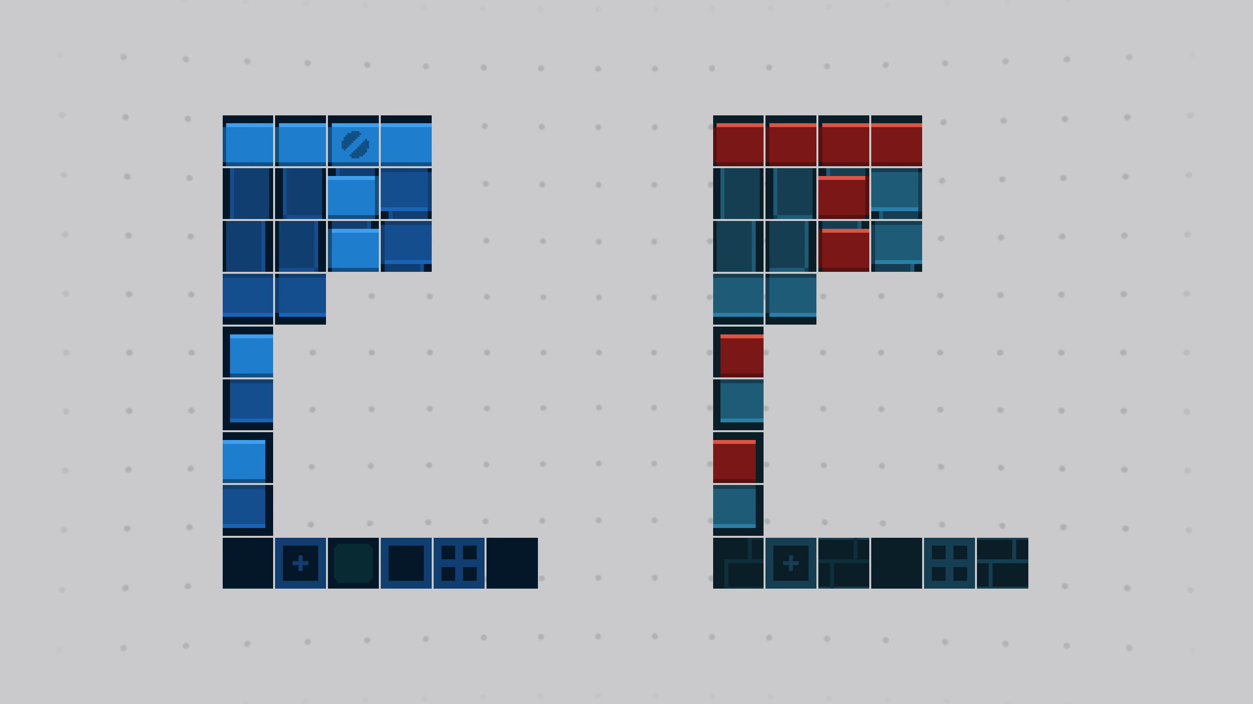
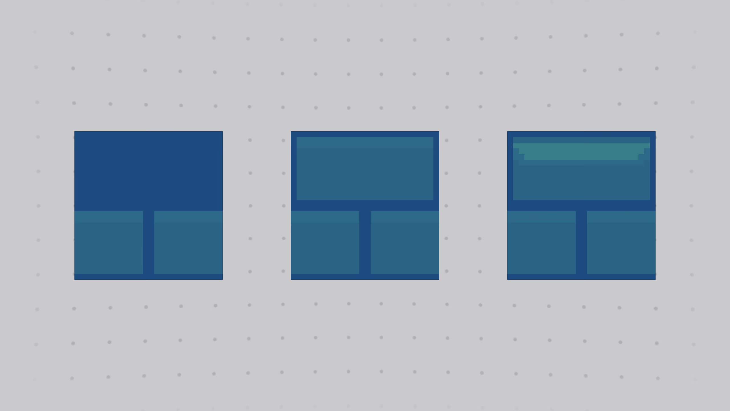
Now, as you might have noticed, all of the levels look rather dull.
They all use the same simple blue tileset, with a basic grid background, and absolutely no decorations or flair.
Now this is actually really useful, because it meant I could focus exclusively on puzzle design rather than visuals. And it meant I could easily change things based on feedback. Maybe move elements around, or start a level from scratch, or move a level into a completely different world. No problem.
But now that I'm happy with the layouts in World 1, it's time to dress them up. To take these boring blue levels, and essentially paint over them to make them look more exciting.
So World 1 takes place in a sewer. I mean, is it really a video game without a sewer level? I've always envisioned the game to be about escaping a factory by going from the bottom floor to the top, and there doesn't get any lower than the sewers.
So here's the step-by-step guide to making a level look nice.
The first step was to replace the tiles. Now this was actually really easy. The tile set for the sewer is laid out in the exact same way as the blueprint tile set. So I can actually just use the paint bucket tool to replace all the tiles with a single click.
I then use some other tiles to add extra details. In this case I'm making it so the brickwork tapers off into plain blue to better frame the image.
Then I bring in the background. I talked about this before in a previous episode, but it's essentially a bunch of overlapping plates with different brightness levels to give a sense of depth.
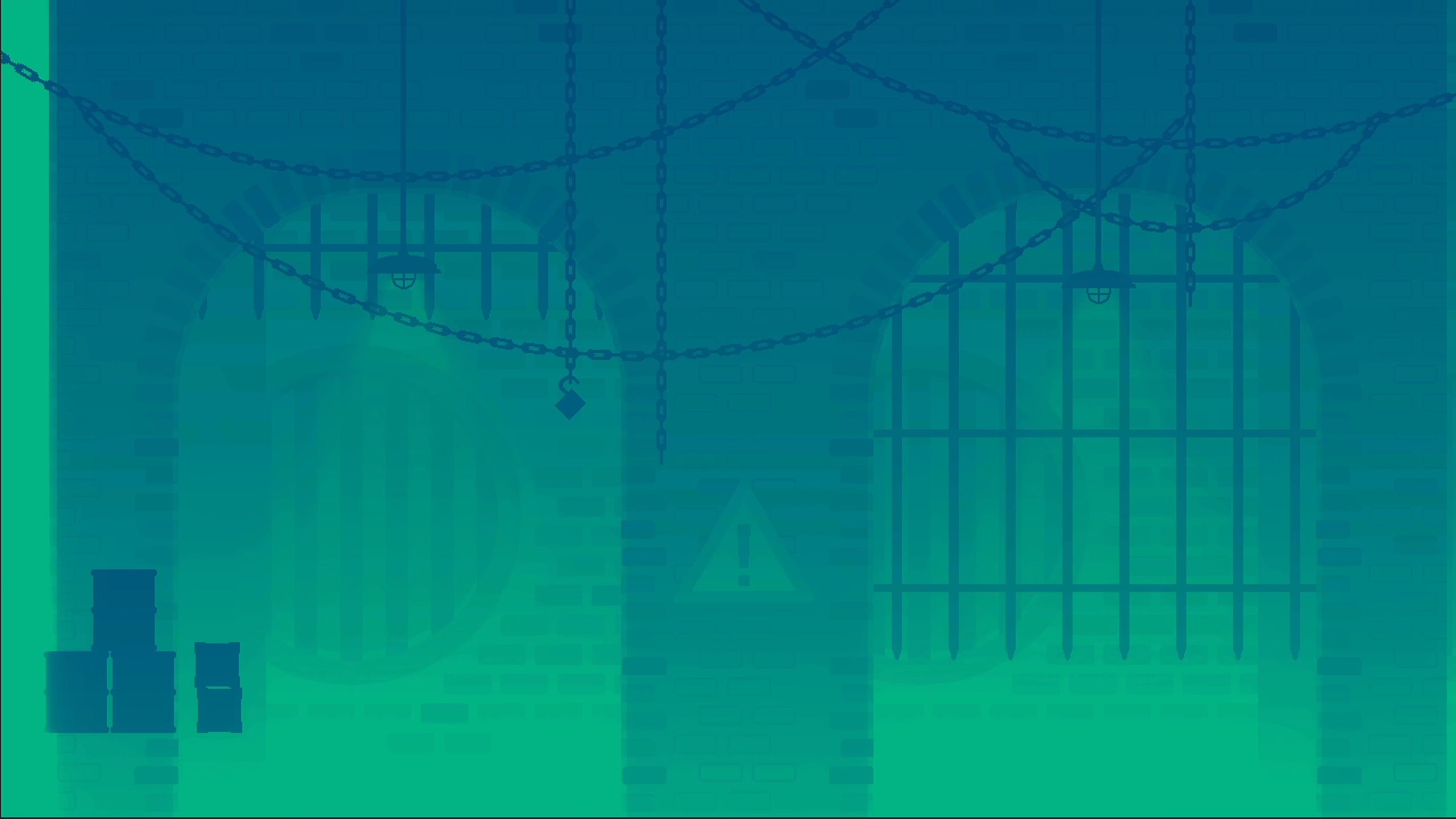
So we've got the back wall, then an aqueduct, then the front walls with details, hanging stuff like chains and lights, and nearby elements like barrels. I then throw on a gradient overlay to wash everything out.
That's actually really important. These backgrounds are just for visual interest, and so they should never compete with the actual important puzzle elements. You can definitely go too far with this.
Take the recently released puzzle platformer, Ugly. It's a good game, and the backgrounds are wonderfully detailed, but almost too detailed. It's hard to tell what's important and what's just set dressing.
So I try to keep my backgrounds unobtrusive. And just as an additional accessibility measure, if you find these things too distracting then you can toggle “Simple Backgrounds”, which replaces the whole thing with the same grid I was using in the rough draft.
Okay, anyway. Another way to add some visual interest is to add some particles. I use just basic circles that appear, float up, and disappear. But they look like little dust motes and make the game feel more alive. And then for this sewer world, I added a bobbing body of water at the bottom of the screen.
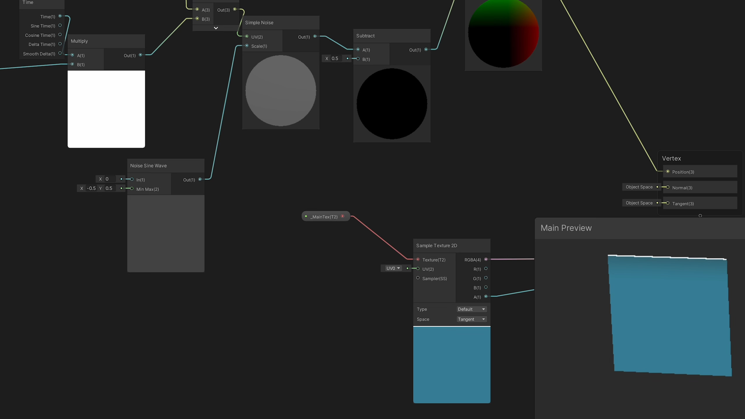
This is made using a very simple and small texture, and then a shader which displaces the pixels using some sine wave or something?
I don't know much about shaders, I just fiddle around with nodes until it looks right.
The next step is to add brick walls, which can be used to break up the background and also highlight certain elements like the exit door.
Now I could have made this with a single tile. Repeat that and you get a perfect brick wall. But it looks a bit rubbish. So I use Unity's rule tile to detect the edges and apply a special pillar on the left or right, a cement lip on the bottom, and a shadow from the wall above at the top.
And then to make it look even more interesting, I use random tiles. So if I take that same brick pattern and have a few variations, and then let Unity pick which tile it uses at random, you get a really nice and visually interesting brick wall.
Oh, and here's an extra cool trick. The bricks all have a semi-transparent black overlay, which is set to only show through a mask. Then I take my character and the magnet and add masks, which are offset to one side. Now when you run past the brick wall, the characters cast shadows. Neat.
Finally, one last step, I add in a few decorations. They're just random bits and bobs - cones, barrels, chains, crates, and so on. They're greyscale and then tinted to a different colour depending on what world they appear in. Phew. I then repeated the same process for all the levels in this world, sometimes adding in unique touches like these pipes, a ladder, and this waterfall.
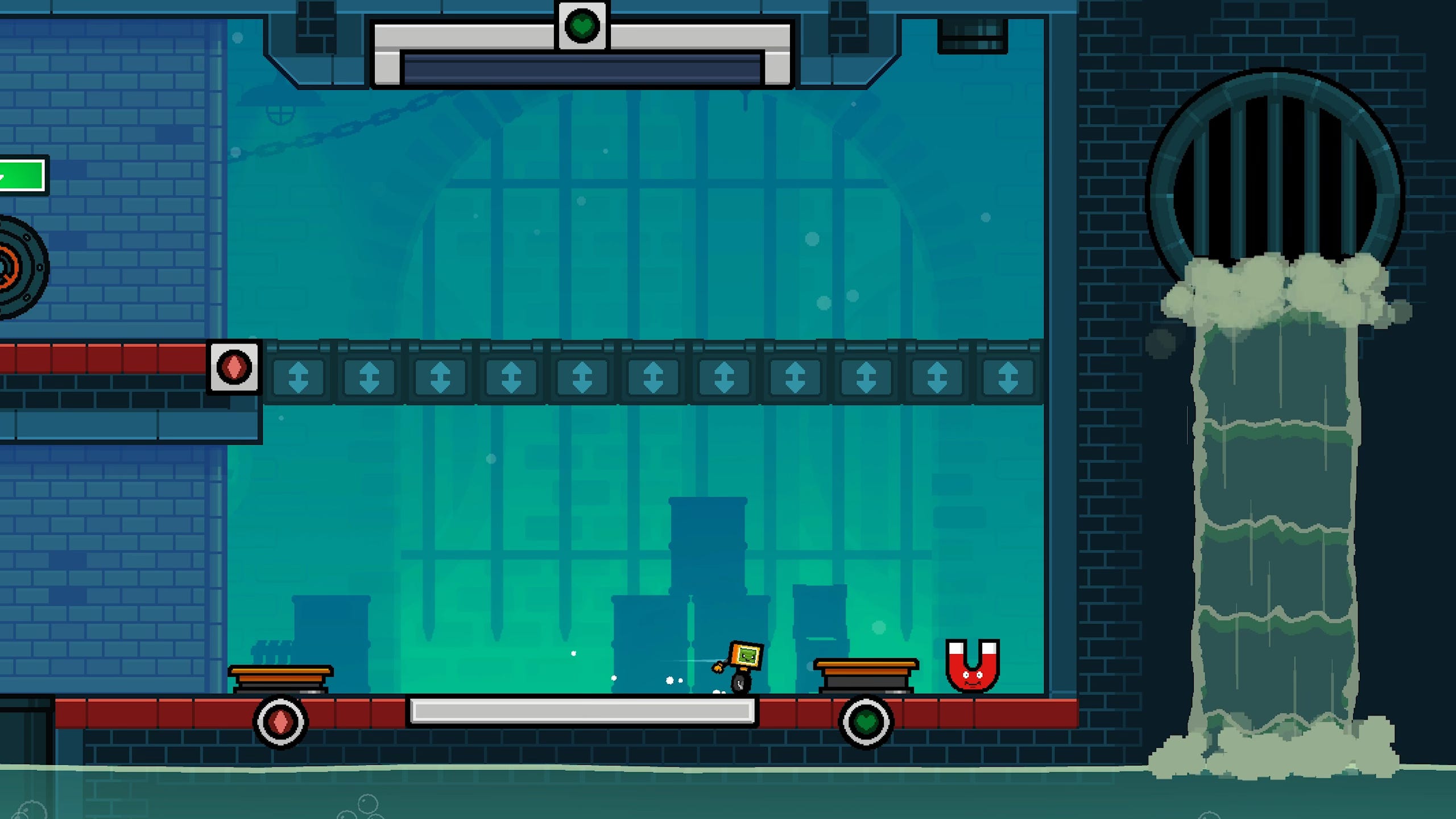
It uses a simple shader to constantly offset this texture's vertical position. And then I use the particle system for the suds at the top and bottom. And in a few levels, I added nuts and bolts which lay on the floor. They kick up when you run through them, and also get yanked up by magnetic fields.
Sound Effects
Okay, so that's visuals done. Time for sound effects. Thankfully, I have added in a lot of the sound effects as I've gone along. When I make a new game mechanic, I don't just do the art and the code, but I try to remember to wire up some sounds to go with it. But there are a few sounds that do still need making.
Now I kind of hate doing sound effects because you have to make the sound, put it in Unity, test it in the game, hate it, and then repeat the process over and over again. Surely there's gotta be a better way. Well this month I found a better way.
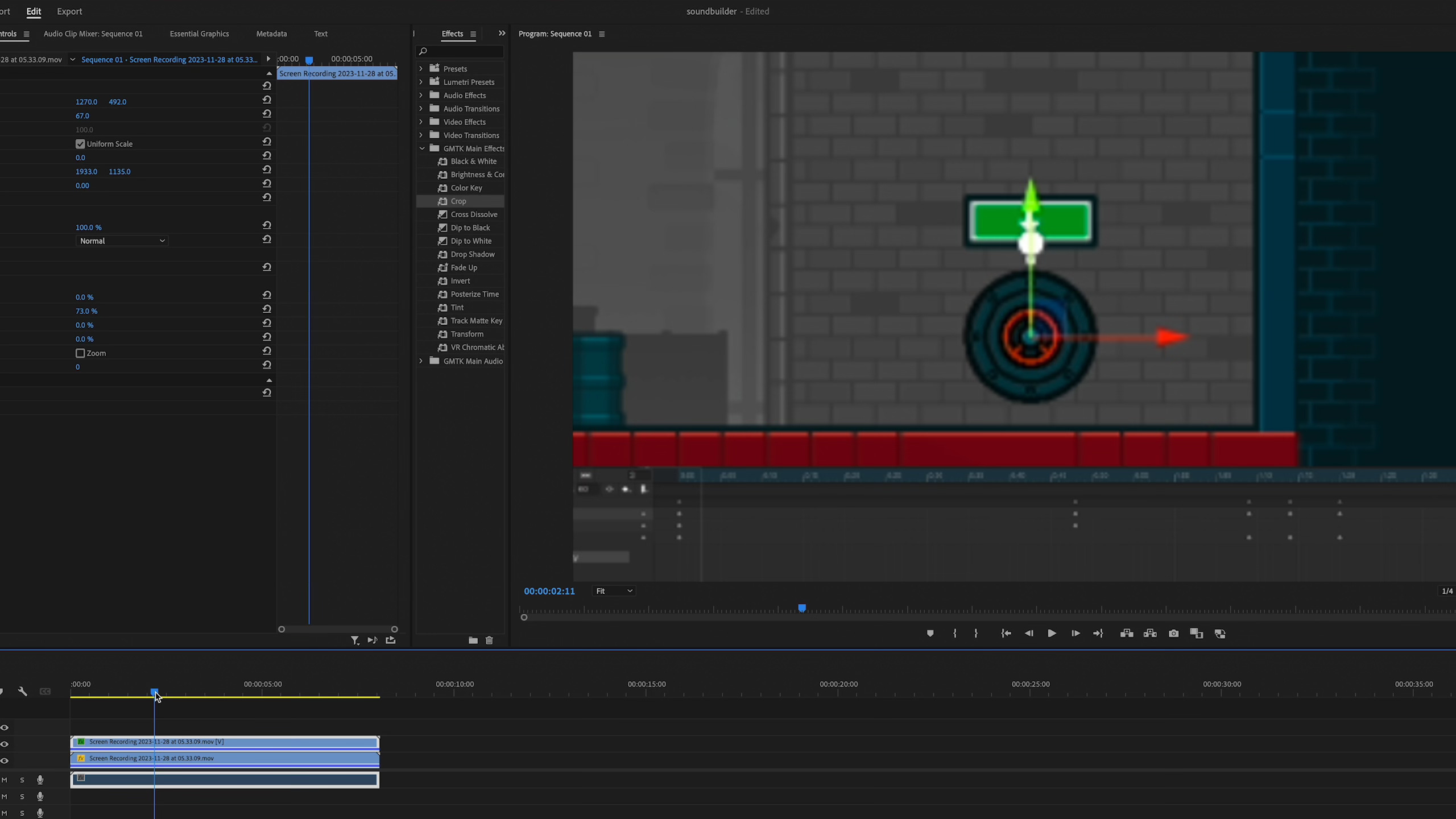
I record a short video of the game - in this case it's this animation of a door being opened. Then I throw it in Adobe Premiere, the video editor I use for GMTK, and basically become a Foley artist as I add sound effects to the video.
Now I can layer sounds on top of each other, throw on effects, and change the EQ, fade things in and out. These sounds are all coming from Epidemic Sound, by the way.
Then once I'm happy, I can export the sound out and pop it in Unity, totally assured that the sound will work nicely with the animation. We are on a roll here.
Cutscenes
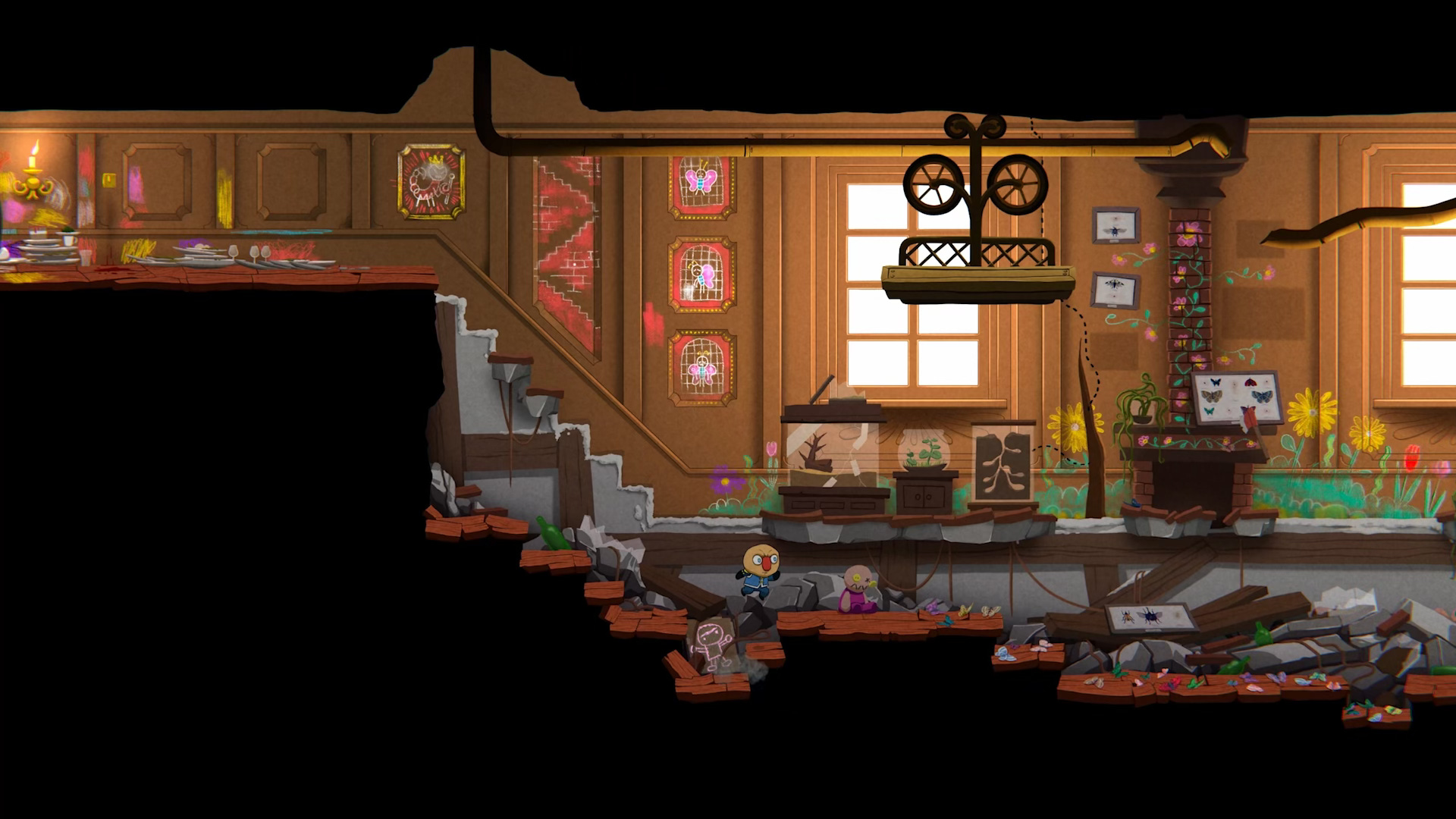
Okay so the rough draft version just immediately drops you into the first puzzle in the game. That's no good, so I made a fancy introductory cutscene to start off the adventure.
And then the rough draft version also introduces you to the Magnet in a very unceremonious fashion, so that also needed a cutscene. I think I'll talk more about story stuff in a later episode, but making this cutscene did lead to a couple neat additions to the game. For starters, it was weird for Magnus to look directly at the camera while talking. He should look at the character, right?
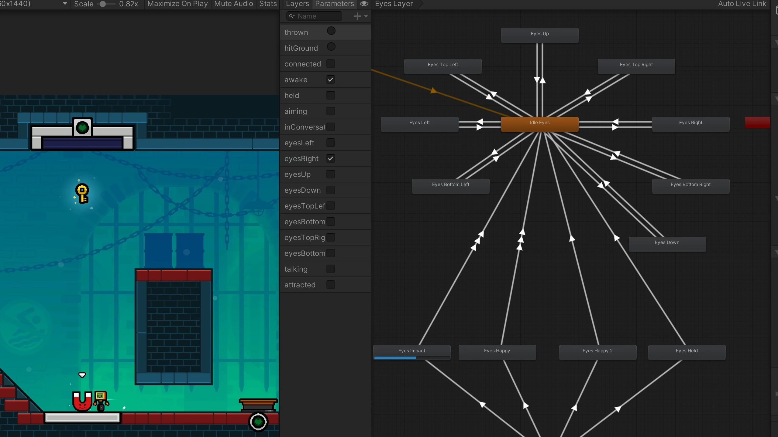
And once I got that working, after a lot of faff, I get so lost in these animation state machines. But once it was working, I realised I could just have it happen at all times.
So now Magnus' eyes will follow the character around the room, which is super cute.
And also, I have speech bubbles that show up during cutscenes. But I wondered, with a few tweaks, could I have the bubbles just show up in normal gameplay? I was definitely inspired by the talking flowers in Super Mario Wonder. But anyway, the answer is yes.
So I now have a bark system where Magnus can shout out little phrases and quips when you do certain things. It's definitely something that needs to be restrained, it could easily become too annoying, but when used subtly, man, it adds a lot of polish and character to the game.
And this is a good lesson for polish, I think. There's basically like two types of polish. There's additive, like I could draw some super unique background art that only appears in a single level. And then there's multiplicative. If I spend some time making Magnus' eyes follow you around the level, that's going to improve every single stage in the game.
And so, if you're a solo dev or in a small team, focus your time and effort on the polish that's going to get the most bang for your buck.
Music, UI and More
With all of that done, I had finished World 1. I'm happy with all of the level designs, the art is nice, the sound effects are done, and the cutscenes are in. The only thing I'm missing is the music.
So now I have a full world in the game that is pretty much complete. And I realised that this would actually make for a nice demo, or something to show off to potential publishers or console makers.
The only problem is, there's still loads of stuff on the meta level that's still unfinished, or placeholder, or unpolished. Like the game still doesn't save your progress, and the options menu looks terrible.
So I spent a whole week making the options menu look nice. I will spare you the details, it wasn't fun to do, it's not fun to talk about. Though Patrons are getting more in-depth devlogs if you do want the nitty gritty details.
I made the game save and load your progress. Also just incredibly boring. A little bit more interesting though is my hint system. Instead of just giving you a bit of text, I try to show the hint visually using dotted lines. I think it's more interesting, it's easier to understand, and you don't need to speak English to get it.
So I've still got a bit more to do, but it's pretty close. As always, if you're a GMTK Patron you can access the World 1 demo right now on PC and Mac. You can also pop in the Discord and help me bug test it if you think that would be fun.
If you're not a Patron, well then the next best thing you can do is go to Steam and add the game to your wishlist. You'll get an email as soon as the game goes live next year, and it also tells Valve to promote my game to as many people as possible.
And so that is it for this month. Thank you so much for watching or reading Developing this year. Sorry, again, for the six month break!